


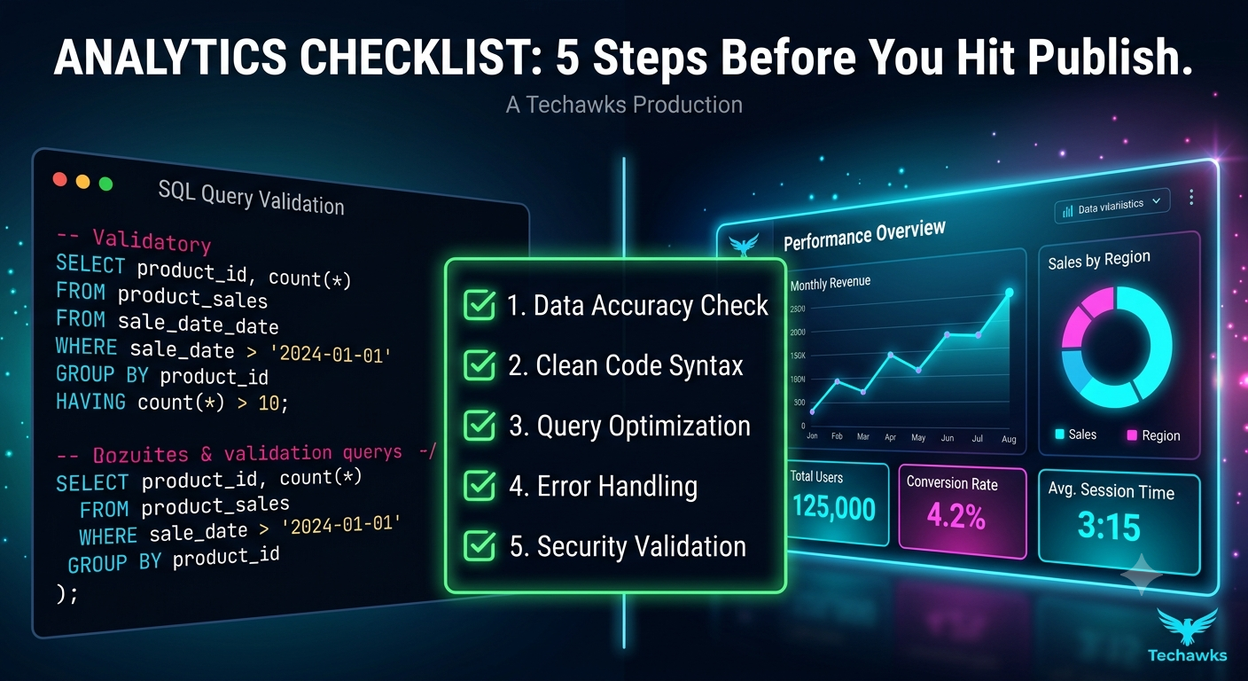
The Pre-Dash Checklist: 5 Steps to Bulletproof Data Visualizations 📊
📋 The Ultimate Pre-Launch Analytics Checklist
1. Data Integrity & Grain Check
Grain Consistency: Are your dimensions aggregation-ready (e.g., daily vs. monthly rollups)?
Null Handling: Did you explicitly handle NULL or missing values so they don't break percentage calculations?
Reconciliation: Do your dashboard totals match your SQL source queries line-for-line?
2. Logic & Calculation Audit
Denominator Integrity: Are division formulas protected against #DIV/0! errors?
Filter Logic: Are global dashboard filters cascading correctly without accidentally dropping rows?
Timeframe Alignment: Are Date filters consistent across all charts (e.g., UTC vs. local timezone)?
3. UX & Visual Clarity
3-Second Rule: Can a stakeholder identify the main takeaway within 3 seconds?
Color Intentionality: Is color used only to highlight key insights or categories (max 3–4 main shades)?
Chart Selection: Did you avoid confusing chart types (like 3D graphs or overcrowded pie charts)?
4. Performance Optimization
Query Execution: Does the dashboard load in under 5 seconds?
Aggregation Level: Are you querying pre-aggregated tables instead of running heavy joins on raw event logs?
5. Stakeholder Context
Clear Tooltips & Labels: Are metric definitions clearly labeled or documented via info buttons?
Actionable Takeaways: Is there a clear next step or "so what?" implied by the data layout?
Key Takeaways
Validate First, Design Second: Data accuracy will always trump pretty visuals.
Optimize for Speed: A slow dashboard is an unused dashboard—aggregate raw data early.
Design for Decision-Makers: Remove visual clutter so executives can spot insights in seconds.
CTA
Ready to level up your SQL, visualization, and data engineering skills?
Join the Techawks Data Science & Analytics Program today to build production-grade dashboards, master advanced analytics, and fast-track your tech career! 🚀
📋 The Ultimate Pre-Launch Analytics Checklist
1. Data Integrity & Grain Check
Grain Consistency: Are your dimensions aggregation-ready (e.g., daily vs. monthly rollups)?
Null Handling: Did you explicitly handle NULL or missing values so they don't break percentage calculations?
Reconciliation: Do your dashboard totals match your SQL source queries line-for-line?
2. Logic & Calculation Audit
Denominator Integrity: Are division formulas protected against #DIV/0! errors?
Filter Logic: Are global dashboard filters cascading correctly without accidentally dropping rows?
Timeframe Alignment: Are Date filters consistent across all charts (e.g., UTC vs. local timezone)?
3. UX & Visual Clarity
3-Second Rule: Can a stakeholder identify the main takeaway within 3 seconds?
Color Intentionality: Is color used only to highlight key insights or categories (max 3–4 main shades)?
Chart Selection: Did you avoid confusing chart types (like 3D graphs or overcrowded pie charts)?
4. Performance Optimization
Query Execution: Does the dashboard load in under 5 seconds?
Aggregation Level: Are you querying pre-aggregated tables instead of running heavy joins on raw event logs?
5. Stakeholder Context
Clear Tooltips & Labels: Are metric definitions clearly labeled or documented via info buttons?
Actionable Takeaways: Is there a clear next step or "so what?" implied by the data layout?
Key Takeaways
Validate First, Design Second: Data accuracy will always trump pretty visuals.
Optimize for Speed: A slow dashboard is an unused dashboard—aggregate raw data early.
Design for Decision-Makers: Remove visual clutter so executives can spot insights in seconds.
CTA
Ready to level up your SQL, visualization, and data engineering skills?
Join the Techawks Data Science & Analytics Program today to build production-grade dashboards, master advanced analytics, and fast-track your tech career! 🚀
The Pre-Dash Checklist: 5 Steps to Bulletproof Data Visualizations 📊
📋 The Ultimate Pre-Launch Analytics Checklist
1. Data Integrity & Grain Check
Grain Consistency: Are your dimensions aggregation-ready (e.g., daily vs. monthly rollups)?
Null Handling: Did you explicitly handle NULL or missing values so they don't break percentage calculations?
Reconciliation: Do your dashboard totals match your SQL source queries line-for-line?
2. Logic & Calculation Audit
Denominator Integrity: Are division formulas protected against #DIV/0! errors?
Filter Logic: Are global dashboard filters cascading correctly without accidentally dropping rows?
Timeframe Alignment: Are Date filters consistent across all charts (e.g., UTC vs. local timezone)?
3. UX & Visual Clarity
3-Second Rule: Can a stakeholder identify the main takeaway within 3 seconds?
Color Intentionality: Is color used only to highlight key insights or categories (max 3–4 main shades)?
Chart Selection: Did you avoid confusing chart types (like 3D graphs or overcrowded pie charts)?
4. Performance Optimization
Query Execution: Does the dashboard load in under 5 seconds?
Aggregation Level: Are you querying pre-aggregated tables instead of running heavy joins on raw event logs?
5. Stakeholder Context
Clear Tooltips & Labels: Are metric definitions clearly labeled or documented via info buttons?
Actionable Takeaways: Is there a clear next step or "so what?" implied by the data layout?
Key Takeaways
Validate First, Design Second: Data accuracy will always trump pretty visuals.
Optimize for Speed: A slow dashboard is an unused dashboard—aggregate raw data early.
Design for Decision-Makers: Remove visual clutter so executives can spot insights in seconds.
CTA
Ready to level up your SQL, visualization, and data engineering skills?
Join the Techawks Data Science & Analytics Program today to build production-grade dashboards, master advanced analytics, and fast-track your tech career! 🚀

 English
 Arabic
 French
 Spanish
 Deutsch
 Turkish
 Dutch
Dutch
 Italiano
 Russian
 Romaian
 Portuguese (Brazil)
 Greek
Greek