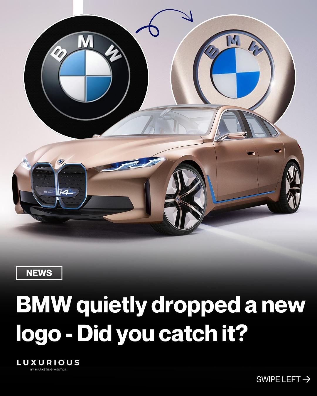
BMW has unveiled a refreshed version of its iconic logo.
While it retains the signature roundel and the blue-and-white Bavarian motif, the black outer ring has been removed in favor of a transparent background. The result? A cleaner, more minimalist aesthetic that aligns seamlessly with today’s digital and branding standards.
First introduced with the BMW i4 Concept, this redesign reflects the brand’s evolution toward electrification and a digital-first approach.
According to BMW, the updated logo is designed to appear more open and approachable, stepping away from the previous 3D, chrome-heavy design.
What do you think of the new look?
#MarketingMentor #Luxurious #BMW
BMW has unveiled a refreshed version of its iconic logo.
While it retains the signature roundel and the blue-and-white Bavarian motif, the black outer ring has been removed in favor of a transparent background. The result? A cleaner, more minimalist aesthetic that aligns seamlessly with today’s digital and branding standards.
First introduced with the BMW i4 Concept, this redesign reflects the brand’s evolution toward electrification and a digital-first approach.
According to BMW, the updated logo is designed to appear more open and approachable, stepping away from the previous 3D, chrome-heavy design.
What do you think of the new look?
#MarketingMentor #Luxurious #BMW
·204 Views
·0 Reviews
