


Design Systems vs. Custom UI: Are Design Systems Killing Product Creativity or Accelerating Scale?
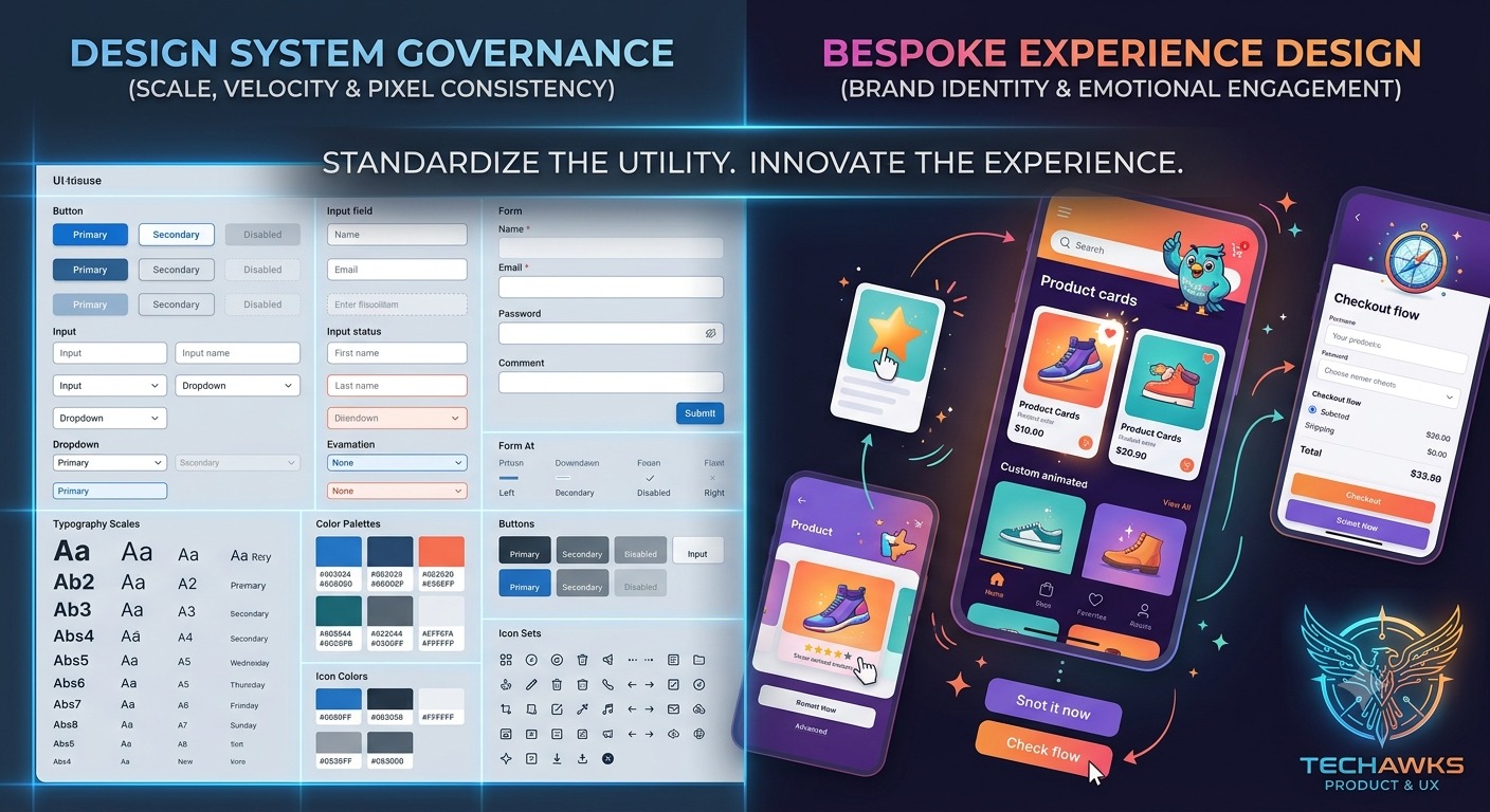
The tension between standardized design systems and custom, bespoke UI components lies at the intersection of operational efficiency and distinctive user experience.
To determine the right architectural balance for your product, it is essential to evaluate how both strategies function across different growth stages:
1. Rigid Design Systems (Component-First Architecture)
The Core Premise: Establishes a single source of truth using standardized tokens, reusable UI components (buttons, modals, inputs), and strict layout grids across web and mobile platforms.
Where It Excels: Enterprise scaling and maintenance. Design systems eliminate redundant work, drastically reduce frontend technical debt, ensure accessibility compliance (WCAG) out of the box, and allow designers to build flows in minutes rather than hours.
The Drawback: Homogenization. When teams treat the component library as a dogma rather than a foundation, they risk forcing user problems into existing components rather than designing custom, context-specific interactions that delight users.
2. Custom UI & Bespoke Interactions (Experience-First Architecture)
The Core Premise: Prioritizes custom animations, micro-interactions, and novel layout structures tailored specifically to the unique value proposition of a feature or brand landing page.
Where It Excels: Brand differentiation and emotional resonance. Custom UI creates memorable, high-converting onboarding experiences and unique product hooks that stand out in crowded SaaS markets.
The Drawback: High maintenance overhead. Every custom component increases engineering surface area, introduces cross-browser bugs, and complicates long-term UI maintenance.
Actionable Advice for Product Leaders & UX Designers
Rather than viewing design systems as an all-or-nothing constraint, top product teams employ a Tiered Governance Model:
Standardize Core Mechanics (80%): Keep utility components—forms, navigation bars, tables, settings menus, and modal dialogs—strictly tied to your design system to maximize velocity.
Allow Sandbox Experimentation (20%): Grant product teams explicit permission to break system guidelines for core "hero features" or onboarding flows where novel interactions directly drive activation.
Build an Intake Pipeline: Establish a clear process where high-performing custom components are audited, refined, and eventually merged into the global design system.
Key Takeaways
Consistency Drives Usability: Standardized components reduce cognitive load for users by maintaining predictable interaction patterns across the platform.
Systems Are Living Products: A design system should evolve based on user needs, not act as a restrictive boundary that suppresses innovation.
Balance Efficiency with Experience: Use design systems to solve solved problems quickly so your team can focus creative energy on novel user challenges.
CTA
How does your team handle the boundary between rigid design system guidelines and bespoke feature design? Join Product, UX & Design to share your system governance models, debate component architecture, and collaborate with lead designers and product managers.
The tension between standardized design systems and custom, bespoke UI components lies at the intersection of operational efficiency and distinctive user experience.
To determine the right architectural balance for your product, it is essential to evaluate how both strategies function across different growth stages:
1. Rigid Design Systems (Component-First Architecture)
The Core Premise: Establishes a single source of truth using standardized tokens, reusable UI components (buttons, modals, inputs), and strict layout grids across web and mobile platforms.
Where It Excels: Enterprise scaling and maintenance. Design systems eliminate redundant work, drastically reduce frontend technical debt, ensure accessibility compliance (WCAG) out of the box, and allow designers to build flows in minutes rather than hours.
The Drawback: Homogenization. When teams treat the component library as a dogma rather than a foundation, they risk forcing user problems into existing components rather than designing custom, context-specific interactions that delight users.
2. Custom UI & Bespoke Interactions (Experience-First Architecture)
The Core Premise: Prioritizes custom animations, micro-interactions, and novel layout structures tailored specifically to the unique value proposition of a feature or brand landing page.
Where It Excels: Brand differentiation and emotional resonance. Custom UI creates memorable, high-converting onboarding experiences and unique product hooks that stand out in crowded SaaS markets.
The Drawback: High maintenance overhead. Every custom component increases engineering surface area, introduces cross-browser bugs, and complicates long-term UI maintenance.
Actionable Advice for Product Leaders & UX Designers
Rather than viewing design systems as an all-or-nothing constraint, top product teams employ a Tiered Governance Model:
Standardize Core Mechanics (80%): Keep utility components—forms, navigation bars, tables, settings menus, and modal dialogs—strictly tied to your design system to maximize velocity.
Allow Sandbox Experimentation (20%): Grant product teams explicit permission to break system guidelines for core "hero features" or onboarding flows where novel interactions directly drive activation.
Build an Intake Pipeline: Establish a clear process where high-performing custom components are audited, refined, and eventually merged into the global design system.
Key Takeaways
Consistency Drives Usability: Standardized components reduce cognitive load for users by maintaining predictable interaction patterns across the platform.
Systems Are Living Products: A design system should evolve based on user needs, not act as a restrictive boundary that suppresses innovation.
Balance Efficiency with Experience: Use design systems to solve solved problems quickly so your team can focus creative energy on novel user challenges.
CTA
How does your team handle the boundary between rigid design system guidelines and bespoke feature design? Join Product, UX & Design to share your system governance models, debate component architecture, and collaborate with lead designers and product managers.
Design Systems vs. Custom UI: Are Design Systems Killing Product Creativity or Accelerating Scale?
The tension between standardized design systems and custom, bespoke UI components lies at the intersection of operational efficiency and distinctive user experience.
To determine the right architectural balance for your product, it is essential to evaluate how both strategies function across different growth stages:
1. Rigid Design Systems (Component-First Architecture)
The Core Premise: Establishes a single source of truth using standardized tokens, reusable UI components (buttons, modals, inputs), and strict layout grids across web and mobile platforms.
Where It Excels: Enterprise scaling and maintenance. Design systems eliminate redundant work, drastically reduce frontend technical debt, ensure accessibility compliance (WCAG) out of the box, and allow designers to build flows in minutes rather than hours.
The Drawback: Homogenization. When teams treat the component library as a dogma rather than a foundation, they risk forcing user problems into existing components rather than designing custom, context-specific interactions that delight users.
2. Custom UI & Bespoke Interactions (Experience-First Architecture)
The Core Premise: Prioritizes custom animations, micro-interactions, and novel layout structures tailored specifically to the unique value proposition of a feature or brand landing page.
Where It Excels: Brand differentiation and emotional resonance. Custom UI creates memorable, high-converting onboarding experiences and unique product hooks that stand out in crowded SaaS markets.
The Drawback: High maintenance overhead. Every custom component increases engineering surface area, introduces cross-browser bugs, and complicates long-term UI maintenance.
Actionable Advice for Product Leaders & UX Designers
Rather than viewing design systems as an all-or-nothing constraint, top product teams employ a Tiered Governance Model:
Standardize Core Mechanics (80%): Keep utility components—forms, navigation bars, tables, settings menus, and modal dialogs—strictly tied to your design system to maximize velocity.
Allow Sandbox Experimentation (20%): Grant product teams explicit permission to break system guidelines for core "hero features" or onboarding flows where novel interactions directly drive activation.
Build an Intake Pipeline: Establish a clear process where high-performing custom components are audited, refined, and eventually merged into the global design system.
Key Takeaways
Consistency Drives Usability: Standardized components reduce cognitive load for users by maintaining predictable interaction patterns across the platform.
Systems Are Living Products: A design system should evolve based on user needs, not act as a restrictive boundary that suppresses innovation.
Balance Efficiency with Experience: Use design systems to solve solved problems quickly so your team can focus creative energy on novel user challenges.
CTA
How does your team handle the boundary between rigid design system guidelines and bespoke feature design? Join Product, UX & Design to share your system governance models, debate component architecture, and collaborate with lead designers and product managers.

 English
 Arabic
 French
 Portuguese
 Deutsch
 Turkish
 Dutch
Dutch
 Italiano
 Russian
 Romaian
 Portuguese (Brazil)
 Greek
Greek