


Techawks Product & UX is a community for product managers, UX/UI designers, researchers, developers, founders, students, and AI enthusiasts passionate about creating exceptional digital products. Whether you're designing your first app or leading enterprise products, you'll find practical insights and meaningful discussions.
Learn product strategy, user experience design, design systems, customer research, prototyping, usability testing, AI-powered product workflows, product analytics, career growth, and real-world case studies. Connect with professionals, share ideas, receive feedback, and stay ahead in the evolving world of product innovation.
Learn product strategy, user experience design, design systems, customer research, prototyping, usability testing, AI-powered product workflows, product analytics, career growth, and real-world case studies. Connect with professionals, share ideas, receive feedback, and stay ahead in the evolving world of product innovation.
-
PBID: 0230001500000010
-
1 people like this
-
58 Posts
-
58 Photos
-
0 Videos
-
Reviews
-
Science and Technology
Search

 Arabic
 French
 Spanish
 Portuguese
 Deutsch
 Turkish
 Dutch
Dutch
 Italiano
 Russian
 Romaian
 Portuguese (Brazil)
 Greek
Greek
Recent Updates
-
The Conversational Crutch: Why Slapping a Chatbox on Your SaaS Is Lazy Product Design
As generative AI toolkits became plug-and-play, product roadmaps fell victim to a massive industry misconception:
❌ The Myth: "Chat is the universal interface of the future. Replacing menus, forms, and control panels with an open prompt box eliminates UI complexity and gives users ultimate flexibility."
✅ The Reality: An empty prompt box forces maximum cognitive load onto the user. It trades clear affordances for a blank-canvas paralysis, slow typing speeds, and non-deterministic UX.
Why the "Everything-as-a-Chat" Pattern Fails:
The Death of Discoverability: Traditional graphical user interfaces (GUIs) communicate what is possible through visible affordances—buttons, sliders, toggles, and filters. A blinking cursor in a chatbox tells the user nothing about system capabilities, boundary limits, or failure states.
The Prompt Tax (Input Friction): Pointing and clicking takes 200 milliseconds. Typing a structured, context-rich prompt takes 30 seconds. Forcing users to articulate routine operations in natural language slows down workflows rather than accelerating them.
Loss of Spatial State & Correction Loops: In a GUI, tweaking a single parameter (like a date range or toggle) is an instant, localized adjustment. In a conversational interface, adjusting one variable requires re-prompting, reading a full response stream, and hoping the model doesn't drift or alter previous variables.
The Better Pattern: Hybrid Contextual Micro-Interactions
World-class AI UX embeds intelligence directly into existing UI paradigms rather than segregating it into a floating chat drawer:
Generative Affordances & Inline Controls: Instead of asking the user to prompt, anticipate their next step. Offer contextual AI suggestions as inline chips, hover-state shortcuts, or dynamic form pre-fills that can be accepted with a single click.
Bi-Directional Canvas UX: Keep the artifact (document, spreadsheet, canvas, or dashboard) front-and-center. Let the AI manipulate the canvas directly while keeping familiar UI levers (sliders, diff reviews, undo buttons) intact for tactile human control.
Scaffolding Over Blank Inputs: Replace the open prompt box with structured scaffolding—pre-built system templates, parameter slot-filling, and guided prompt builders that constrain the solution space.
The takeaway: Great UX is about reducing cognitive overhead, not showcasing model capabilities. The most powerful AI interface isn't a conversation—it's an interface so frictionless that the user barely realizes an AI is doing the heavy lifting.
Discussion Question
Where in your product has conversational AI actually reduced task-completion time, and where did it just add an unnecessary layer of typing?
CTA (Join Product, UX & Design)
Join the Product, UX & Design community to debate emerging interaction patterns, dissect real-world design systems, and build intuitive, human-centered products.The Conversational Crutch: Why Slapping a Chatbox on Your SaaS Is Lazy Product Design As generative AI toolkits became plug-and-play, product roadmaps fell victim to a massive industry misconception: ❌ The Myth: "Chat is the universal interface of the future. Replacing menus, forms, and control panels with an open prompt box eliminates UI complexity and gives users ultimate flexibility." ✅ The Reality: An empty prompt box forces maximum cognitive load onto the user. It trades clear affordances for a blank-canvas paralysis, slow typing speeds, and non-deterministic UX. Why the "Everything-as-a-Chat" Pattern Fails: The Death of Discoverability: Traditional graphical user interfaces (GUIs) communicate what is possible through visible affordances—buttons, sliders, toggles, and filters. A blinking cursor in a chatbox tells the user nothing about system capabilities, boundary limits, or failure states. The Prompt Tax (Input Friction): Pointing and clicking takes 200 milliseconds. Typing a structured, context-rich prompt takes 30 seconds. Forcing users to articulate routine operations in natural language slows down workflows rather than accelerating them. Loss of Spatial State & Correction Loops: In a GUI, tweaking a single parameter (like a date range or toggle) is an instant, localized adjustment. In a conversational interface, adjusting one variable requires re-prompting, reading a full response stream, and hoping the model doesn't drift or alter previous variables. The Better Pattern: Hybrid Contextual Micro-Interactions World-class AI UX embeds intelligence directly into existing UI paradigms rather than segregating it into a floating chat drawer: Generative Affordances & Inline Controls: Instead of asking the user to prompt, anticipate their next step. Offer contextual AI suggestions as inline chips, hover-state shortcuts, or dynamic form pre-fills that can be accepted with a single click. Bi-Directional Canvas UX: Keep the artifact (document, spreadsheet, canvas, or dashboard) front-and-center. Let the AI manipulate the canvas directly while keeping familiar UI levers (sliders, diff reviews, undo buttons) intact for tactile human control. Scaffolding Over Blank Inputs: Replace the open prompt box with structured scaffolding—pre-built system templates, parameter slot-filling, and guided prompt builders that constrain the solution space. The takeaway: Great UX is about reducing cognitive overhead, not showcasing model capabilities. The most powerful AI interface isn't a conversation—it's an interface so frictionless that the user barely realizes an AI is doing the heavy lifting. Discussion Question Where in your product has conversational AI actually reduced task-completion time, and where did it just add an unnecessary layer of typing? CTA (Join Product, UX & Design) Join the Product, UX & Design community to debate emerging interaction patterns, dissect real-world design systems, and build intuitive, human-centered products.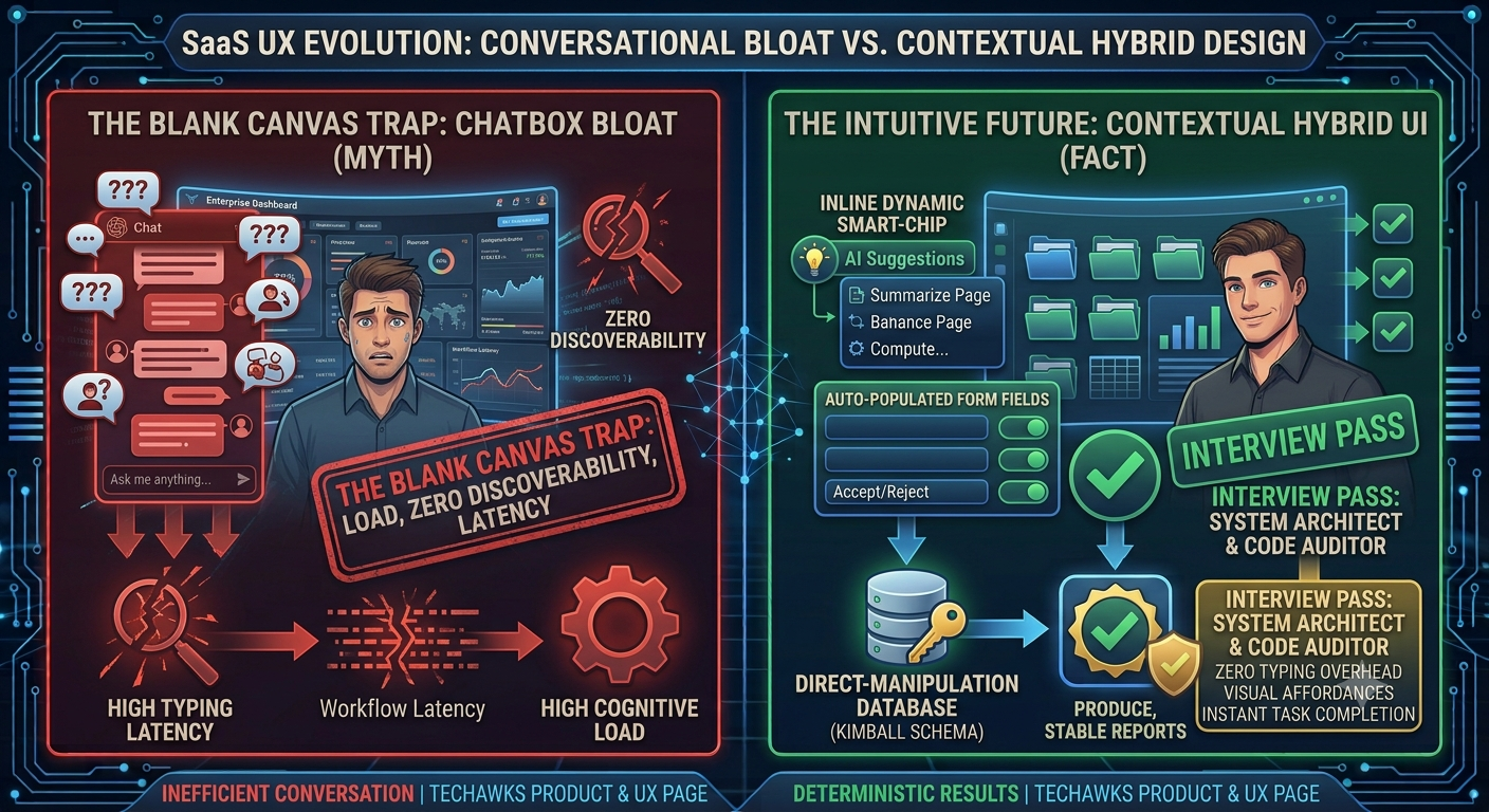 0 Comments 0 Shares 75 Views 0 Reviews
 -
The Chat Window Is a UX Failure: Why Enterprise Workflows Are Rejecting Conversational Interfaces
Product teams across SaaS made a collective design bet: “Natural language is the universal interface. Replace complex dashboards with a chat bar, and users will type their way to value.”
Users aren’t adopting it. Instead, they bounce back to rigid tables and buttons.
The conversational paradigm collapses in enterprise software due to three core interaction design breakdowns:
The Blank Canvas Tax (Zero Affordance): A text input offers zero visual discovery. Users don’t want to guess magical prompt syntax to extract a report; traditional UI buttons and filter chips visually map system capabilities directly into the user’s mental model.
Context Fragmentation: Forcing a user to jump out of their working canvas into a narrow side-drawer chat window fragments spatial context. When an agent acts on complex tables or canvas nodes, forcing the explanation into a vertical text stream forces users to read through terminal-like walls of prose just to verify an edit.
The "Confirm Everything" Approval Fatigue: Chatbot workflows often alternate between two extremes: executing actions blindly (destroying trust) or asking "Are you sure?" at every trivial step (destroying velocity).
The Product Shift: Embedded, Inline Agentic UX
High-performing product designers are ditching chat sidebars for Contextual Canvas Primitives:
Diff Over Dialogue: Don't tell the user what changed in conversational text. Render inline visual diffs (strikethroughs, color-coded delta rows, preview cards) directly inside the artifact where the work lives.
Granular Checkpoint Cards: Reserve human-in-the-loop gates strictly for high-blast-radius mutations (e.g., spending budget, deleting records, emailing external clients). Make low-stakes, reversible edits instant, backed by a persistent global undo/replay buffer.
The Shared Autonomy Dial: Allow users to calibrate agent delegation per task:
Draft/Propose Mode: Agent produces editable staged states.
Supervised Mode: Agent auto-executes routine steps and pauses at critical branches.
Delegated Mode: Agent executes autonomously with a clean historical audit log.
Chat was a temporary bridge for conversational models. True product mastery embeds autonomous capabilities invisibly into the native interface canvas.
Discussion Question
Where in your product has a conversational interface actually reduced friction, and where did it just add an unnecessary layer of prompt-typing over a button?
CTA
Design intuitive user journeys, master AI interaction paradigms, and lead the future of user experience. Join Product, UX & Design at Techawks Product & UX.The Chat Window Is a UX Failure: Why Enterprise Workflows Are Rejecting Conversational Interfaces Product teams across SaaS made a collective design bet: “Natural language is the universal interface. Replace complex dashboards with a chat bar, and users will type their way to value.” Users aren’t adopting it. Instead, they bounce back to rigid tables and buttons. The conversational paradigm collapses in enterprise software due to three core interaction design breakdowns: The Blank Canvas Tax (Zero Affordance): A text input offers zero visual discovery. Users don’t want to guess magical prompt syntax to extract a report; traditional UI buttons and filter chips visually map system capabilities directly into the user’s mental model. Context Fragmentation: Forcing a user to jump out of their working canvas into a narrow side-drawer chat window fragments spatial context. When an agent acts on complex tables or canvas nodes, forcing the explanation into a vertical text stream forces users to read through terminal-like walls of prose just to verify an edit. The "Confirm Everything" Approval Fatigue: Chatbot workflows often alternate between two extremes: executing actions blindly (destroying trust) or asking "Are you sure?" at every trivial step (destroying velocity). The Product Shift: Embedded, Inline Agentic UX High-performing product designers are ditching chat sidebars for Contextual Canvas Primitives: Diff Over Dialogue: Don't tell the user what changed in conversational text. Render inline visual diffs (strikethroughs, color-coded delta rows, preview cards) directly inside the artifact where the work lives. Granular Checkpoint Cards: Reserve human-in-the-loop gates strictly for high-blast-radius mutations (e.g., spending budget, deleting records, emailing external clients). Make low-stakes, reversible edits instant, backed by a persistent global undo/replay buffer. The Shared Autonomy Dial: Allow users to calibrate agent delegation per task: Draft/Propose Mode: Agent produces editable staged states. Supervised Mode: Agent auto-executes routine steps and pauses at critical branches. Delegated Mode: Agent executes autonomously with a clean historical audit log. Chat was a temporary bridge for conversational models. True product mastery embeds autonomous capabilities invisibly into the native interface canvas. Discussion Question Where in your product has a conversational interface actually reduced friction, and where did it just add an unnecessary layer of prompt-typing over a button? CTA Design intuitive user journeys, master AI interaction paradigms, and lead the future of user experience. Join Product, UX & Design at Techawks Product & UX.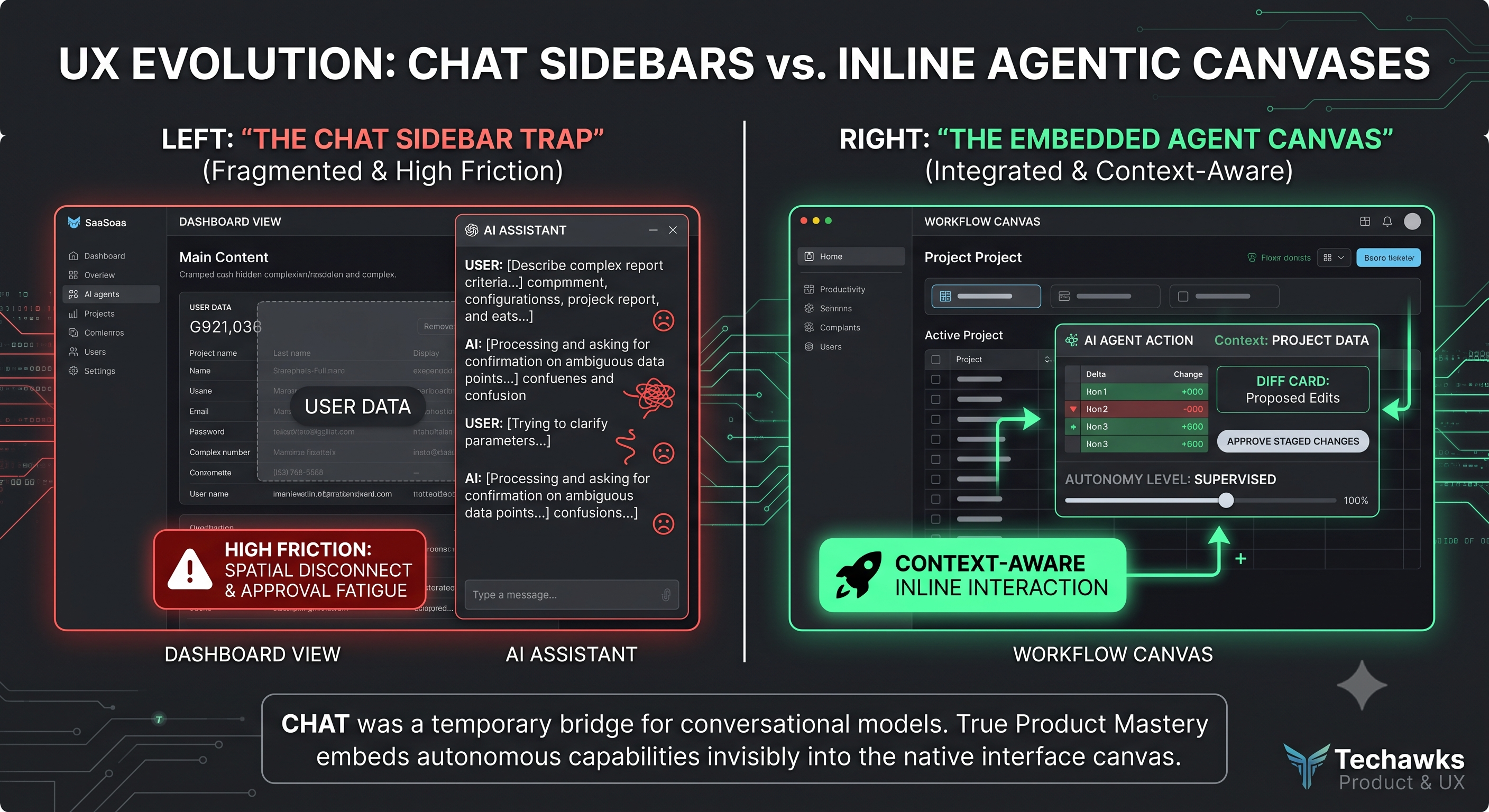 0 Comments 0 Shares 117 Views 0 Reviews
 -
The Chat Box Is Lazy UX: Why Conversational Interfaces Are Failing Complex Products
Over the last two years, product teams responded to the AI wave by putting a text input and a streaming message thread onto every dashboard. The assumption was simple: natural language is universal, so conversational UI must be the ultimate interface.
In practice, chat-first interfaces are breaking down across complex enterprise workflows.
A blank text box violates core usability heuristics:
Zero Discoverability: A blank input forces the user to recall system capabilities from memory rather than recognizing them visually. If users don't know what to ask, the feature doesn't exist.
Massive Cognitive Load: Writing a multi-clause prompt to filter a dataset requires significantly more mental effort than clicking two checkboxes and a date picker.
Lack of Direct Manipulation: When an AI tool returns a 400-word wall of conversational text, users cannot slice the data, reorder columns, or inspect outliers without initiating another slow round-trip prompt.
The future of AI product design isn't conversational text—it is Generative UI (GenUI) and outcome-oriented scaffolding.
Instead of confining AI to a sidebar thread, build adaptive interfaces where natural language acts as an accelerator, not the container:
Intent to Structured Component: When an agent acts on user intent, do not stream paragraphs. Stream interactive components—stateful comparison tables, editable parameter cards, interactive sliders, or visual diffs.
Keep Direct Manipulation First-Class: Give users instant visual controls to tweak the agent's output. Changing a parameter should take a single toggle, not a 30-word re-prompt.
Design the Decision Checkpoints: Autonomous agents should not work in an invisible black box until completion. Surface state snapshots, intermediate tool runs, and explicit approval gates for destructive actions.
Stop asking your users to write essays to operate your software. Design systems that turn fuzzy intent into clear, manipulable interfaces.
Discussion Question
Are your AI features trapped in an isolated sidebar chat, or has your team started integrating dynamic, generative UI components directly into user canvases?
CTA (Join Product, UX & Design)
Tired of superficial chat wrappers and ready to design high-impact, human-in-the-loop AI software?
👉 Join the Techawks Product, UX & Design Community to explore real GenUI design systems, challenge interaction dogma, and build intuitive products alongside top design leaders:The Chat Box Is Lazy UX: Why Conversational Interfaces Are Failing Complex Products Over the last two years, product teams responded to the AI wave by putting a text input and a streaming message thread onto every dashboard. The assumption was simple: natural language is universal, so conversational UI must be the ultimate interface. In practice, chat-first interfaces are breaking down across complex enterprise workflows. A blank text box violates core usability heuristics: Zero Discoverability: A blank input forces the user to recall system capabilities from memory rather than recognizing them visually. If users don't know what to ask, the feature doesn't exist. Massive Cognitive Load: Writing a multi-clause prompt to filter a dataset requires significantly more mental effort than clicking two checkboxes and a date picker. Lack of Direct Manipulation: When an AI tool returns a 400-word wall of conversational text, users cannot slice the data, reorder columns, or inspect outliers without initiating another slow round-trip prompt. The future of AI product design isn't conversational text—it is Generative UI (GenUI) and outcome-oriented scaffolding. Instead of confining AI to a sidebar thread, build adaptive interfaces where natural language acts as an accelerator, not the container: Intent to Structured Component: When an agent acts on user intent, do not stream paragraphs. Stream interactive components—stateful comparison tables, editable parameter cards, interactive sliders, or visual diffs. Keep Direct Manipulation First-Class: Give users instant visual controls to tweak the agent's output. Changing a parameter should take a single toggle, not a 30-word re-prompt. Design the Decision Checkpoints: Autonomous agents should not work in an invisible black box until completion. Surface state snapshots, intermediate tool runs, and explicit approval gates for destructive actions. Stop asking your users to write essays to operate your software. Design systems that turn fuzzy intent into clear, manipulable interfaces. Discussion Question Are your AI features trapped in an isolated sidebar chat, or has your team started integrating dynamic, generative UI components directly into user canvases? CTA (Join Product, UX & Design) Tired of superficial chat wrappers and ready to design high-impact, human-in-the-loop AI software? 👉 Join the Techawks Product, UX & Design Community to explore real GenUI design systems, challenge interaction dogma, and build intuitive products alongside top design leaders: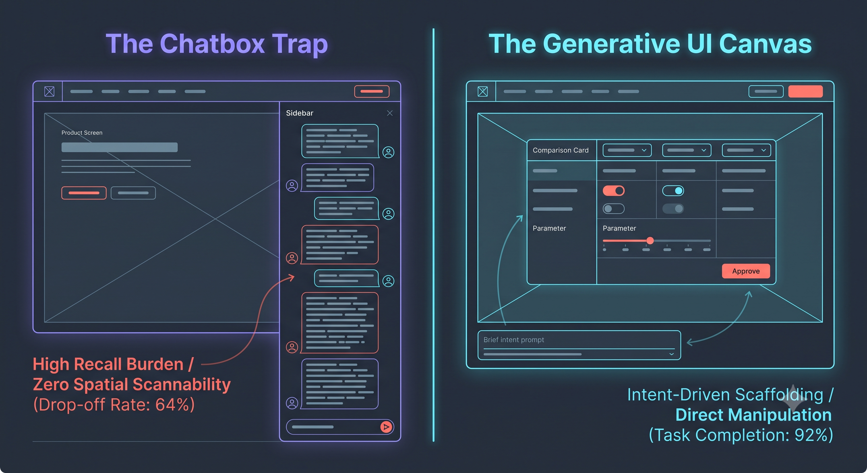 0 Comments 0 Shares 207 Views 0 Reviews
 -
Stop Designing AI Like a Chatbot: The 4-Step Agentic UX & Supervision Checklist for Modern Product Teams
As products shift from simple text prompts to autonomous, multi-step agentic workflows, the role of product managers and designers has fundamentally evolved. You are no longer just designing static screens or linear forms; you are building supervision spaces where humans delegate, monitor, and override automated decisions.
To build trust, reduce cognitive load, and prevent user churn in modern AI applications, use this actionable Agentic UX checklist:
Design for Radical Transparency: Never treat AI output as an absolute black box. Surface confidence scores, cite data sources, and show the intermediate steps an agent takes so users understand why a recommendation was made.
Implement Seamless Interruption & Override Controls: Give users absolute authority. Ensure every automated action can be previewed, paused, edited, or stopped mid-flight without breaking the entire workflow.
Build Clear Failure-State Design: When models hallucinate, hit rate limits, or encounter ambiguous inputs, avoid generic error spinners. Design graceful fallback states with clear manual recovery paths.
Prioritize Calm Over Complexity: Resist the urge to clutter dashboards with endless model metrics. Use progressive disclosure to reveal technical complexity only when the user explicitly requests a deep dive.
Discussion Question: What is your biggest friction point when designing for AI-driven products—communicating model uncertainty without losing user trust, or building intuitive controls for multi-step agent workflows? Let us know below!
CTA (Join Product, UX & Design): Ready to build the next generation of user-centric digital experiences? Join Product, UX & Design to access advanced frameworks, teardowns, and top-tier career growth resources.Stop Designing AI Like a Chatbot: The 4-Step Agentic UX & Supervision Checklist for Modern Product Teams As products shift from simple text prompts to autonomous, multi-step agentic workflows, the role of product managers and designers has fundamentally evolved. You are no longer just designing static screens or linear forms; you are building supervision spaces where humans delegate, monitor, and override automated decisions. To build trust, reduce cognitive load, and prevent user churn in modern AI applications, use this actionable Agentic UX checklist: Design for Radical Transparency: Never treat AI output as an absolute black box. Surface confidence scores, cite data sources, and show the intermediate steps an agent takes so users understand why a recommendation was made. Implement Seamless Interruption & Override Controls: Give users absolute authority. Ensure every automated action can be previewed, paused, edited, or stopped mid-flight without breaking the entire workflow. Build Clear Failure-State Design: When models hallucinate, hit rate limits, or encounter ambiguous inputs, avoid generic error spinners. Design graceful fallback states with clear manual recovery paths. Prioritize Calm Over Complexity: Resist the urge to clutter dashboards with endless model metrics. Use progressive disclosure to reveal technical complexity only when the user explicitly requests a deep dive. Discussion Question: What is your biggest friction point when designing for AI-driven products—communicating model uncertainty without losing user trust, or building intuitive controls for multi-step agent workflows? Let us know below! CTA (Join Product, UX & Design): Ready to build the next generation of user-centric digital experiences? Join Product, UX & Design to access advanced frameworks, teardowns, and top-tier career growth resources.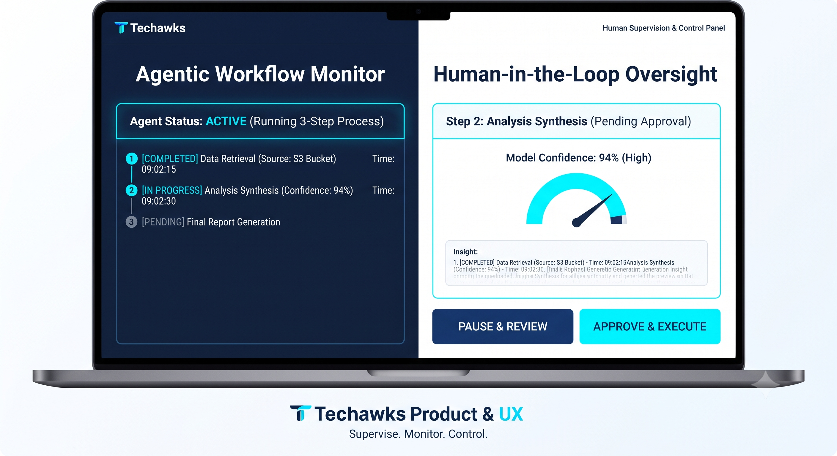 0 Comments 0 Shares 158 Views 0 Reviews
 -
Beyond Feature-Factorying: The Rise of Deterministic Workflow Stewardship
We are moving past the novelty phase of AI in product development. High-performing teams are shifting their engineering effort away from open-ended, non-deterministic "Generative AI" features towards Agentic Choreography & Workflow Stewardship.
This means transitioning from merely predicting text to executing state-safe business logic.
For Product Managers and Designers, this requires a fundamental architectural rethink: stop trying to build autonomous agents that automate broken processes, and start designing Deterministic Systems that safely coordinate LLMs for high-reliability outputs.
The 2 Principles of Agentic Stewardship for PMs & Designers:
Shift Focus from Prompts to Bounded State Machines (FSMs)
Open-ended agent loops (ReAct) fail in production because they get caught in token recursion or cannot reliably execute safe database transactions.
Design Action: Mandate that your engineering teams isolate LLM reasoning steps from deterministic action steps. Every agent action (like database writes or API calls) must be bound by a finite-state machine with a hard exit strategy (e.g., maximum of three retry loops before human escalation). Your PRDs should now require deterministic failure mode definitions, not just acceptance criteria.
Isolate State from Inference (Stateless Agents Pattern)
Don't pass raw conversation history between multi-turn agent calls. It causes context drift, linear token cost inflation, and high latency.
Design Action: Treat your LLM as a stateless task processor. Maintain system state in structured, key-value external caches. Only pass transaction "diffs" (only the specific state change needed for the immediate task) between agent turns, rather than bloating the reasoning context with raw chat logs.
AI should not be the product; AI should be the high-fidelity orchestration mechanism that makes the product's underlying, reliable data layers accessible. The product stewardship of 2026 is about engineering reliability into a probabilistic world.
Discussion Question
For PMs and Engineers currently deploying agents: Where is your biggest bottleneck to reliability—is it context drift over multi-turn interactions, agents failing to adhere to structured JSON schemas, or managing token budgets with long-context windows? Let's discuss architecture patterns below.
CTA
Ready to build reliable, scalable AI systems?
👉 Join the Techawks Product, UX & Design Community to master deterministic system design, agent orchestration, and production-grade product thinking Alongside industry practitioners.Beyond Feature-Factorying: The Rise of Deterministic Workflow Stewardship We are moving past the novelty phase of AI in product development. High-performing teams are shifting their engineering effort away from open-ended, non-deterministic "Generative AI" features towards Agentic Choreography & Workflow Stewardship. This means transitioning from merely predicting text to executing state-safe business logic. For Product Managers and Designers, this requires a fundamental architectural rethink: stop trying to build autonomous agents that automate broken processes, and start designing Deterministic Systems that safely coordinate LLMs for high-reliability outputs. The 2 Principles of Agentic Stewardship for PMs & Designers: Shift Focus from Prompts to Bounded State Machines (FSMs) Open-ended agent loops (ReAct) fail in production because they get caught in token recursion or cannot reliably execute safe database transactions. Design Action: Mandate that your engineering teams isolate LLM reasoning steps from deterministic action steps. Every agent action (like database writes or API calls) must be bound by a finite-state machine with a hard exit strategy (e.g., maximum of three retry loops before human escalation). Your PRDs should now require deterministic failure mode definitions, not just acceptance criteria. Isolate State from Inference (Stateless Agents Pattern) Don't pass raw conversation history between multi-turn agent calls. It causes context drift, linear token cost inflation, and high latency. Design Action: Treat your LLM as a stateless task processor. Maintain system state in structured, key-value external caches. Only pass transaction "diffs" (only the specific state change needed for the immediate task) between agent turns, rather than bloating the reasoning context with raw chat logs. AI should not be the product; AI should be the high-fidelity orchestration mechanism that makes the product's underlying, reliable data layers accessible. The product stewardship of 2026 is about engineering reliability into a probabilistic world. Discussion Question For PMs and Engineers currently deploying agents: Where is your biggest bottleneck to reliability—is it context drift over multi-turn interactions, agents failing to adhere to structured JSON schemas, or managing token budgets with long-context windows? Let's discuss architecture patterns below. CTA Ready to build reliable, scalable AI systems? 👉 Join the Techawks Product, UX & Design Community to master deterministic system design, agent orchestration, and production-grade product thinking Alongside industry practitioners. 0 Comments 0 Shares 1K Views 0 Reviews
 -
Beyond the Chatbot: Why 2026 UX Design Belongs to "Steerable Canvas" Interfaces
When generative AI hit mainstream software, the industry defaulted to conversational UI. Chat was simple to ship, but for real workflows, pure chat interfaces carry massive UX friction:
The "Black-Hole" Context Problem: Once generated content scrolls past the viewport, it's buried in a transient thread.
Coarse-Grained Manipulation: If an LLM generates a 1,000-word product requirements document and gets one paragraph wrong, users must either re-prompt the whole model or copy-paste it into another editor to fix it manually.
Blind Autonomy: When autonomous agents act purely in the background without clear visual state changes, users experience anxiety and loss of agency.
The Paradigm Shift: From Chat Threads to Steerable Canvases
The leading product teams are abandoning generic chat boxes in favor of Steerable Canvas & Workspace UX:
Inline, Contextual Lenses over Conversational Pings:
Instead of asking a chat assistant to update a screen, interactions happen directly on the artifact (documents, wireframes, code, or data tables). The UI exposes discrete, inline micro-actions: highlight a section to rewrite, expand, or run a semantic diff.
"Intent Previews" & Autonomy Dials:
When agents execute multi-step automations across tools (e.g., updating a Jira sprint, drafting a PR, syncing customer feedback), don't just output a final summary. Expose an expandable execution plan before execution with three options: Proceed, Edit Plan, or Cancel. Giving users a slider to adjust agent autonomy per task builds long-term operational trust.
Dual-State Synchronization:
The workspace maintains an interactive visual canvas alongside a lightweight, collapsible trace drawer. The agent updates structured components in real time while showing plain-language rationale—not raw logs—for why it took each step.
Great product design has never been about making the user talk to software. It is about reducing the cognitive distance between human intent and the finished outcome.
Discussion Question
Is your team moving away from chat drawers toward canvas-based, inline AI interactions? What has been your biggest usability challenge when balancing agent autonomy with user control?
CTA
Bridge the gap between cutting-edge technology and intuitive product design. Join product managers, UI/UX researchers, and design systems architects inside Product, UX & Design to unpack real-world design systems, teardowns, and user research frameworks.Beyond the Chatbot: Why 2026 UX Design Belongs to "Steerable Canvas" Interfaces When generative AI hit mainstream software, the industry defaulted to conversational UI. Chat was simple to ship, but for real workflows, pure chat interfaces carry massive UX friction: The "Black-Hole" Context Problem: Once generated content scrolls past the viewport, it's buried in a transient thread. Coarse-Grained Manipulation: If an LLM generates a 1,000-word product requirements document and gets one paragraph wrong, users must either re-prompt the whole model or copy-paste it into another editor to fix it manually. Blind Autonomy: When autonomous agents act purely in the background without clear visual state changes, users experience anxiety and loss of agency. The Paradigm Shift: From Chat Threads to Steerable Canvases The leading product teams are abandoning generic chat boxes in favor of Steerable Canvas & Workspace UX: Inline, Contextual Lenses over Conversational Pings: Instead of asking a chat assistant to update a screen, interactions happen directly on the artifact (documents, wireframes, code, or data tables). The UI exposes discrete, inline micro-actions: highlight a section to rewrite, expand, or run a semantic diff. "Intent Previews" & Autonomy Dials: When agents execute multi-step automations across tools (e.g., updating a Jira sprint, drafting a PR, syncing customer feedback), don't just output a final summary. Expose an expandable execution plan before execution with three options: Proceed, Edit Plan, or Cancel. Giving users a slider to adjust agent autonomy per task builds long-term operational trust. Dual-State Synchronization: The workspace maintains an interactive visual canvas alongside a lightweight, collapsible trace drawer. The agent updates structured components in real time while showing plain-language rationale—not raw logs—for why it took each step. Great product design has never been about making the user talk to software. It is about reducing the cognitive distance between human intent and the finished outcome. Discussion Question Is your team moving away from chat drawers toward canvas-based, inline AI interactions? What has been your biggest usability challenge when balancing agent autonomy with user control? CTA Bridge the gap between cutting-edge technology and intuitive product design. Join product managers, UI/UX researchers, and design systems architects inside Product, UX & Design to unpack real-world design systems, teardowns, and user research frameworks. 0 Comments 0 Shares 199 Views 0 Reviews
 -
Killing the Chatbot Shell: The Rise of Generative & Intent-Driven UI
When generative AI first entered enterprise software, teams defaulted to conversational interfaces. But chat is fundamentally one-dimensional: it has high cognitive load, lacks spatial affordance, and destroys scannability.
In product design, Generative UI represents the true paradigm shift: instead of returning unstructured markdown, the model selects and renders functional, stateful components directly out of your existing design system.
The Fundamental Shift: From Fixed Screens to Assembled Moments
Traditional UX design requires mapping every static screen and edge-case state beforehand. Generative UI flips this:
The Designer’s New Scope: Designers stop delivering fixed 50-screen Figma user journeys. Instead, they design strict constraint systems, layout heuristics, atomic design tokens, and modular UI primitives (cards, micro-filters, confirmation blocks).
Runtime Assembly: Based on user intent and context, the orchestration layer dynamically selects the right primitives, populates the schema, and renders an ephemeral, interactive micro-view.
Three UX Principles for Generative Interfaces:
Interactive Summaries Over Prose Walls: If a user queries "Compare Q3 churn across European enterprise accounts," the system shouldn’t stream three paragraphs. It should generate an interactive, sortable data grid with active inline filters and a visual sparkline.
Shared Autonomy & Staged Execution: For agentic actions, never hide intent behind a generic "working..." spinner. Use Checkpoint UX: render an explicit preview card showing exactly what parameters the agent staged (e.g., recipient list, payload diff), allowing the human to approve, reject, or edit in place before execution.
Transparent Layout Attribution: When an interface dynamically rearranges its layout or promotes specific widgets, explain why. A simple ambient cue—"Arranged based on your recent sprint review priorities"—preserves the mental model and prevents the user from feeling disoriented by shifting navigation.
The most intuitive AI products will not look like chat apps. They will look like dynamic software that re-engineers its own canvas around the user's immediate intent.
Discussion Question
Is your product team moving beyond generic text-based chat towards rendering dynamic, typed UI components? What guardrails have you built into your design system to keep generative layouts coherent?
CTA (Join Product, UX & Design)
Ready to transition from static screen design to building generative, agentic user experiences? Join the Product, UX & Design community to discuss design system constraints, AI interaction heuristics, and practical product teardowns.Killing the Chatbot Shell: The Rise of Generative & Intent-Driven UI When generative AI first entered enterprise software, teams defaulted to conversational interfaces. But chat is fundamentally one-dimensional: it has high cognitive load, lacks spatial affordance, and destroys scannability. In product design, Generative UI represents the true paradigm shift: instead of returning unstructured markdown, the model selects and renders functional, stateful components directly out of your existing design system. The Fundamental Shift: From Fixed Screens to Assembled Moments Traditional UX design requires mapping every static screen and edge-case state beforehand. Generative UI flips this: The Designer’s New Scope: Designers stop delivering fixed 50-screen Figma user journeys. Instead, they design strict constraint systems, layout heuristics, atomic design tokens, and modular UI primitives (cards, micro-filters, confirmation blocks). Runtime Assembly: Based on user intent and context, the orchestration layer dynamically selects the right primitives, populates the schema, and renders an ephemeral, interactive micro-view. Three UX Principles for Generative Interfaces: Interactive Summaries Over Prose Walls: If a user queries "Compare Q3 churn across European enterprise accounts," the system shouldn’t stream three paragraphs. It should generate an interactive, sortable data grid with active inline filters and a visual sparkline. Shared Autonomy & Staged Execution: For agentic actions, never hide intent behind a generic "working..." spinner. Use Checkpoint UX: render an explicit preview card showing exactly what parameters the agent staged (e.g., recipient list, payload diff), allowing the human to approve, reject, or edit in place before execution. Transparent Layout Attribution: When an interface dynamically rearranges its layout or promotes specific widgets, explain why. A simple ambient cue—"Arranged based on your recent sprint review priorities"—preserves the mental model and prevents the user from feeling disoriented by shifting navigation. The most intuitive AI products will not look like chat apps. They will look like dynamic software that re-engineers its own canvas around the user's immediate intent. Discussion Question Is your product team moving beyond generic text-based chat towards rendering dynamic, typed UI components? What guardrails have you built into your design system to keep generative layouts coherent? CTA (Join Product, UX & Design) Ready to transition from static screen design to building generative, agentic user experiences? Join the Product, UX & Design community to discuss design system constraints, AI interaction heuristics, and practical product teardowns. 0 Comments 0 Shares 208 Views 0 Reviews
 -
The Death of the Chat Sidebar: Why Product Designers Are Moving to "Shared Canvas" & Generative UX
Across B2B SaaS, developer tools, and creative suites, users are experiencing acute "chat fatigue."
Forcing multi-step operations into a vertical text scroll creates massive cognitive friction:
The "Blind Box" Problem: Once an agent takes multi-step actions or generates tables, they disappear up the scroll history.
Zero Spatial Manipulation: You cannot drag, split, reorder, or edit raw chat bubbles without starting a brand-new prompt cycle.
Lack of State Awareness: Users lose track of what has actually changed in their workspace versus what was merely discussed in the thread.
The industry is moving rapidly toward Canvas-Centric Workspaces and Generative Component UI. Instead of treating AI as an outside conversationalist, the interface becomes a persistent, shared working surface where human and agent co-author directly.
The 3 Principles of Designing Canvas & Agentic UX
1. Persistent Artifacts over Fleeting Messages
Never trap executable or structured output in a chat bubble.
The Pattern: Implement a dual-pane or fluid canvas where prompts occur in a lightweight command line or input dock, but outputs render as interactive Artifacts (documents, editable tables, diagrams, code blocks).
The Rule: The user must be able to directly click and edit any generated element without asking the model to rewrite the whole artifact.
2. Action Receipts & State Diffing
When users delegate tasks to an agent, anxiety spikes if the system acts silently.
Replace generic loading spinners with an Activity Timeline revealing step-by-step tool calls.
Introduce Action Receipts and visual diffing (e.g., green/red change highlights) so users can approve mutations before they commit to production state.
3. Dynamic "Just-in-Time" UI Components
Instead of shipping hundreds of static, specialized settings screens, modern design systems are moving toward Generative UI:
The model returns structured component definitions (e.g., filtered date pickers, mini-dashboards, custom sliders) dynamically rendered from a strict, pre-approved design token library.
The layout adapts to the immediate context of the user's task instead of forcing them to navigate deep menu trees.
The Product Takeaway: The next generation of winning software won't have a "chat tab." AI will be woven directly into the canvas as an invisible, direct-manipulation collaborator.
Discussion Question
Is your product team moving away from chat drawers toward persistent canvases or inline generative artifacts? What has been your biggest design hurdle with user trust?
CTA
Join Product, UX & Design
Master modern interaction design, agentic product patterns, and generative UI frameworks with top product leaders and designers. Join Techawks Product & UX today:The Death of the Chat Sidebar: Why Product Designers Are Moving to "Shared Canvas" & Generative UX Across B2B SaaS, developer tools, and creative suites, users are experiencing acute "chat fatigue." Forcing multi-step operations into a vertical text scroll creates massive cognitive friction: The "Blind Box" Problem: Once an agent takes multi-step actions or generates tables, they disappear up the scroll history. Zero Spatial Manipulation: You cannot drag, split, reorder, or edit raw chat bubbles without starting a brand-new prompt cycle. Lack of State Awareness: Users lose track of what has actually changed in their workspace versus what was merely discussed in the thread. The industry is moving rapidly toward Canvas-Centric Workspaces and Generative Component UI. Instead of treating AI as an outside conversationalist, the interface becomes a persistent, shared working surface where human and agent co-author directly. The 3 Principles of Designing Canvas & Agentic UX 1. Persistent Artifacts over Fleeting Messages Never trap executable or structured output in a chat bubble. The Pattern: Implement a dual-pane or fluid canvas where prompts occur in a lightweight command line or input dock, but outputs render as interactive Artifacts (documents, editable tables, diagrams, code blocks). The Rule: The user must be able to directly click and edit any generated element without asking the model to rewrite the whole artifact. 2. Action Receipts & State Diffing When users delegate tasks to an agent, anxiety spikes if the system acts silently. Replace generic loading spinners with an Activity Timeline revealing step-by-step tool calls. Introduce Action Receipts and visual diffing (e.g., green/red change highlights) so users can approve mutations before they commit to production state. 3. Dynamic "Just-in-Time" UI Components Instead of shipping hundreds of static, specialized settings screens, modern design systems are moving toward Generative UI: The model returns structured component definitions (e.g., filtered date pickers, mini-dashboards, custom sliders) dynamically rendered from a strict, pre-approved design token library. The layout adapts to the immediate context of the user's task instead of forcing them to navigate deep menu trees. The Product Takeaway: The next generation of winning software won't have a "chat tab." AI will be woven directly into the canvas as an invisible, direct-manipulation collaborator. Discussion Question Is your product team moving away from chat drawers toward persistent canvases or inline generative artifacts? What has been your biggest design hurdle with user trust? CTA Join Product, UX & Design Master modern interaction design, agentic product patterns, and generative UI frameworks with top product leaders and designers. Join Techawks Product & UX today: 0 Comments 0 Shares 175 Views 0 Reviews
 -
Beyond the Chatbox: Why Agentic UX Demands State Machines, Not Text Streams
The industry is experiencing a massive UX paradigm shift. In copilot interactions, the user retains direct execution: the AI drafts, the user clicks "Send" or "Commit." But in Agentic UX, the system takes sequential, multi-step actions autonomously—querying databases, calling APIs, modifying workspaces, and triggering external webhooks.
When you squeeze autonomous behavior into a linear chat window, critical usability breaks down:
The "Black Box" Anxiety: Users can’t tell whether an agent is looping infinitely, executing a irreversible financial API, or simply waiting on a slow network handshake.
Confirmation Fatigue: Asking "Should I proceed?" at every minor sub-task ruins autonomy; asking nothing creates catastrophic operational risk.
Product managers and designers must stop designing conversational interfaces and start building Interactive State Machines & Progressive Disclosure Canvases:
Staged Plan Previews Over Blind Execution: Before triggering an autonomous sequence, render a structured, editable plan card. State the explicit blast radius: "This agent will update 14 records across 2 tables and trigger 1 outbound webhook". Allow users to deselect or reorder individual steps before granting runtime clearance.
Deterministic Checkpoints (Gate the Blast Radius): Implement risk-tiered human-in-the-loop gates. Read-only data queries and drafting actions run unattended; irreversible operations (payments, external sends, data deletions) pause the state machine and render a high-visibility diff card requiring explicit confirmation.
Generative Micro-UIs Over Prose Logs: Stop dumping 50 lines of streaming agent thought logs. Instead, project dynamic, contextual micro-components into the canvas—an interactive table to review extracted rows, a diff-slider for code/copy changes, or an immediate rollback switch.
The goal of great AI product design isn’t to simulate human conversation. It’s to earn user trust by making autonomy legible, bounded, and reversible.
Discussion Question
POLL: What is your team’s biggest challenge when designing interfaces for autonomous AI agents?
Balancing autonomy vs. confirmation fatigue (HITL friction)
Visualizing complex multi-step reasoning without clutter
Designing graceful rollback & error-recovery affordances
Convincing users to trust the agent’s intermediate plans
Drop your vote below and let us know what UI patterns you're testing!
CTA
Ready to master agentic product design, user trust heuristics, and interface architecture alongside world-class designers and PMs?
👉 Join Product, UX & Design [link in bio/comments] to access real design systems, UI teardowns, and modern product strategy frameworks.Beyond the Chatbox: Why Agentic UX Demands State Machines, Not Text Streams The industry is experiencing a massive UX paradigm shift. In copilot interactions, the user retains direct execution: the AI drafts, the user clicks "Send" or "Commit." But in Agentic UX, the system takes sequential, multi-step actions autonomously—querying databases, calling APIs, modifying workspaces, and triggering external webhooks. When you squeeze autonomous behavior into a linear chat window, critical usability breaks down: The "Black Box" Anxiety: Users can’t tell whether an agent is looping infinitely, executing a irreversible financial API, or simply waiting on a slow network handshake. Confirmation Fatigue: Asking "Should I proceed?" at every minor sub-task ruins autonomy; asking nothing creates catastrophic operational risk. Product managers and designers must stop designing conversational interfaces and start building Interactive State Machines & Progressive Disclosure Canvases: Staged Plan Previews Over Blind Execution: Before triggering an autonomous sequence, render a structured, editable plan card. State the explicit blast radius: "This agent will update 14 records across 2 tables and trigger 1 outbound webhook". Allow users to deselect or reorder individual steps before granting runtime clearance. Deterministic Checkpoints (Gate the Blast Radius): Implement risk-tiered human-in-the-loop gates. Read-only data queries and drafting actions run unattended; irreversible operations (payments, external sends, data deletions) pause the state machine and render a high-visibility diff card requiring explicit confirmation. Generative Micro-UIs Over Prose Logs: Stop dumping 50 lines of streaming agent thought logs. Instead, project dynamic, contextual micro-components into the canvas—an interactive table to review extracted rows, a diff-slider for code/copy changes, or an immediate rollback switch. The goal of great AI product design isn’t to simulate human conversation. It’s to earn user trust by making autonomy legible, bounded, and reversible. Discussion Question POLL: What is your team’s biggest challenge when designing interfaces for autonomous AI agents? Balancing autonomy vs. confirmation fatigue (HITL friction) Visualizing complex multi-step reasoning without clutter Designing graceful rollback & error-recovery affordances Convincing users to trust the agent’s intermediate plans Drop your vote below and let us know what UI patterns you're testing! CTA Ready to master agentic product design, user trust heuristics, and interface architecture alongside world-class designers and PMs? 👉 Join Product, UX & Design [link in bio/comments] to access real design systems, UI teardowns, and modern product strategy frameworks. 0 Comments 0 Shares 180 Views 0 Reviews
 -
The Death of Feature Factory PMs: Why "Human-in-the-Loop" Is Your Next Career Moat
Recent industry benchmarks reveal a striking reality: over 97% of enterprise users override AI agent recommendations when the underlying reasoning isn't transparent or steerable. Meanwhile, Gartner reports that only 22% of enterprise AI initiatives have successfully scaled across business units.
The bottleneck in tech today isn't algorithm capability—it’s trust architecture.
If your product portfolio is focused purely on prompting AI to write tickets faster or slapping a chat wrapper onto existing dashboards, your product career is running on borrowed time. When software shifts from deterministic buttons to probabilistic agent workflows, the role of product managers and UX designers fundamentally changes.
Here is the three-part framework top product leaders are using to design high-trust systems:
1. Shift from Task Execution to "Escalation Boundaries"
Traditional UX optimizes for zero friction. In autonomous and agentic systems, friction is a safety feature. Your job as a PM/Designer is not to automate every step; it is to map the Reversibility Matrix:
Low-impact / High-reversibility (e.g., categorizing a ticket, draft summarization): Full autonomy.
High-impact / Irreversible (e.g., executing a contract, modifying billing logic): Mandate Explicit Gateways—requiring active human sign-off with clear provenance trails.
2. Design "Provenance-First" Affordances
Users don’t trust black-box automation. High-leverage designers are deprecating vague progress spinners in favor of Inspectable State Engines:
Show intermediate tool-use steps in plain language.
Provide dynamic confidence ratings.
Enable one-click parameter rewinds rather than forcing the user to start over.
3. Redefine Your Value Equation
In the pre-agent era, PM value was measured by velocity: How fast did you ship?
In the agentic era, PM value is measured by Error Margin & Governance: How reliably does the system fail gracefully when the model is uncertain?
Career takeaway: Don’t just learn how to use AI tools—learn how to design systems that keep humans sovereign. The builders who master explainability, fallback architecture, and agent control planes are the ones setting the product agenda for the next decade.
Discussion Question
When you’re designing an automated or agentic workflow, where do you draw the line between frictionless autonomy and mandatory human friction? What signals trigger a manual override in your product?
CTA
Ready to move past feature-building and master systems-level product leadership?
👉 Join Product, UX & Design on Techawks for daily frameworks, deep dives, and peer critiques with top industry leaders.The Death of Feature Factory PMs: Why "Human-in-the-Loop" Is Your Next Career Moat Recent industry benchmarks reveal a striking reality: over 97% of enterprise users override AI agent recommendations when the underlying reasoning isn't transparent or steerable. Meanwhile, Gartner reports that only 22% of enterprise AI initiatives have successfully scaled across business units. The bottleneck in tech today isn't algorithm capability—it’s trust architecture. If your product portfolio is focused purely on prompting AI to write tickets faster or slapping a chat wrapper onto existing dashboards, your product career is running on borrowed time. When software shifts from deterministic buttons to probabilistic agent workflows, the role of product managers and UX designers fundamentally changes. Here is the three-part framework top product leaders are using to design high-trust systems: 1. Shift from Task Execution to "Escalation Boundaries" Traditional UX optimizes for zero friction. In autonomous and agentic systems, friction is a safety feature. Your job as a PM/Designer is not to automate every step; it is to map the Reversibility Matrix: Low-impact / High-reversibility (e.g., categorizing a ticket, draft summarization): Full autonomy. High-impact / Irreversible (e.g., executing a contract, modifying billing logic): Mandate Explicit Gateways—requiring active human sign-off with clear provenance trails. 2. Design "Provenance-First" Affordances Users don’t trust black-box automation. High-leverage designers are deprecating vague progress spinners in favor of Inspectable State Engines: Show intermediate tool-use steps in plain language. Provide dynamic confidence ratings. Enable one-click parameter rewinds rather than forcing the user to start over. 3. Redefine Your Value Equation In the pre-agent era, PM value was measured by velocity: How fast did you ship? In the agentic era, PM value is measured by Error Margin & Governance: How reliably does the system fail gracefully when the model is uncertain? Career takeaway: Don’t just learn how to use AI tools—learn how to design systems that keep humans sovereign. The builders who master explainability, fallback architecture, and agent control planes are the ones setting the product agenda for the next decade. Discussion Question When you’re designing an automated or agentic workflow, where do you draw the line between frictionless autonomy and mandatory human friction? What signals trigger a manual override in your product? CTA Ready to move past feature-building and master systems-level product leadership? 👉 Join Product, UX & Design on Techawks for daily frameworks, deep dives, and peer critiques with top industry leaders.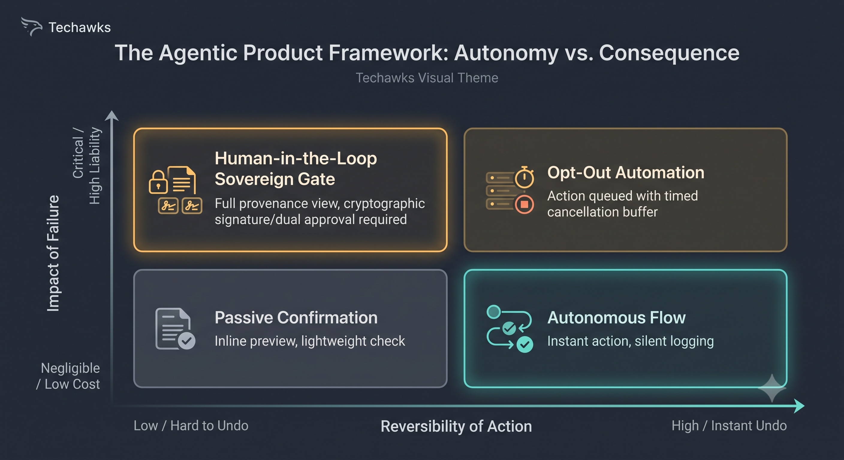 0 Comments 0 Shares 474 Views 0 Reviews
 -
Chat UI Is Not the Default: The Fallacy of Conversational Everything
As agentic and generative features rapidly scale across modern software, conversational chat has become the lazy fallback pattern for digital products. Teams assume natural language is the ultimate interface because humans naturally speak in sentences.
In day-to-day software design, however, chat is often one of the lowest-bandwidth interaction modes available.
Myth: The ultimate UX for autonomous and generative AI is a conversational chat interface.
Fact: Chat demands high cognitive effort, hides application affordances, and replaces single-click actions with tedious typing and vague prompt engineering.
Why chat-first interfaces break user experience in complex workflows:
The Blank Slate Paralysis: Structured GUI controls (buttons, segmented toggles, dropdowns) reveal system capabilities at a glance. An empty text input conceals what the system can and cannot do, leaving users guessing the right vocabulary to get results.
Bandwidth Degradation: Selecting a date range or adjusting a filter requires two clicks in a visual UI (<1 second). Explaining that same operation in conversational natural language requires typing a 15-word prompt, waiting for generation, and reading a wordy response.
Loss of Deterministic Control: Users want predictability for repeatable workflows. Chat output is inherently non-deterministic and ephemeral, making auditability, batch edits, and spatial comparison unnecessarily frustrating.
How to Design AI-Native UX Without Defaulting to Chat:
Use Inline Contextual Augmentation: Embed AI where work already happens. Offer inline micro-completions, contextual suggestions, or side-by-side alternative variations rather than forcing users into a disconnected messaging window.
Implement "Generative GUI" (Structured Controls over Prompting): Surface clickable chips, sliders, and interactive preview cards that allow users to steer agent parameters visually without formulating natural language commands.
Design Clear Intervention Points: For autonomous agents, replace conversational back-and-forth with an Agent Activity Timeline and high-contrast approval checkpoints showing Intent, Confidence, and a single-click Override.
Discussion Question
Where have you seen AI features fail by forcing a chat interface when a structured, one-click GUI element would have been 10x faster?
CTA
Ready to move past conversational gimmicks and master genuine human-agent interface design? Join the Product, UX & Design community to collaborate on interaction models, heuristic frameworks, and product strategy.Chat UI Is Not the Default: The Fallacy of Conversational Everything As agentic and generative features rapidly scale across modern software, conversational chat has become the lazy fallback pattern for digital products. Teams assume natural language is the ultimate interface because humans naturally speak in sentences. In day-to-day software design, however, chat is often one of the lowest-bandwidth interaction modes available. Myth: The ultimate UX for autonomous and generative AI is a conversational chat interface. Fact: Chat demands high cognitive effort, hides application affordances, and replaces single-click actions with tedious typing and vague prompt engineering. Why chat-first interfaces break user experience in complex workflows: The Blank Slate Paralysis: Structured GUI controls (buttons, segmented toggles, dropdowns) reveal system capabilities at a glance. An empty text input conceals what the system can and cannot do, leaving users guessing the right vocabulary to get results. Bandwidth Degradation: Selecting a date range or adjusting a filter requires two clicks in a visual UI (<1 second). Explaining that same operation in conversational natural language requires typing a 15-word prompt, waiting for generation, and reading a wordy response. Loss of Deterministic Control: Users want predictability for repeatable workflows. Chat output is inherently non-deterministic and ephemeral, making auditability, batch edits, and spatial comparison unnecessarily frustrating. How to Design AI-Native UX Without Defaulting to Chat: Use Inline Contextual Augmentation: Embed AI where work already happens. Offer inline micro-completions, contextual suggestions, or side-by-side alternative variations rather than forcing users into a disconnected messaging window. Implement "Generative GUI" (Structured Controls over Prompting): Surface clickable chips, sliders, and interactive preview cards that allow users to steer agent parameters visually without formulating natural language commands. Design Clear Intervention Points: For autonomous agents, replace conversational back-and-forth with an Agent Activity Timeline and high-contrast approval checkpoints showing Intent, Confidence, and a single-click Override. Discussion Question Where have you seen AI features fail by forcing a chat interface when a structured, one-click GUI element would have been 10x faster? CTA Ready to move past conversational gimmicks and master genuine human-agent interface design? Join the Product, UX & Design community to collaborate on interaction models, heuristic frameworks, and product strategy.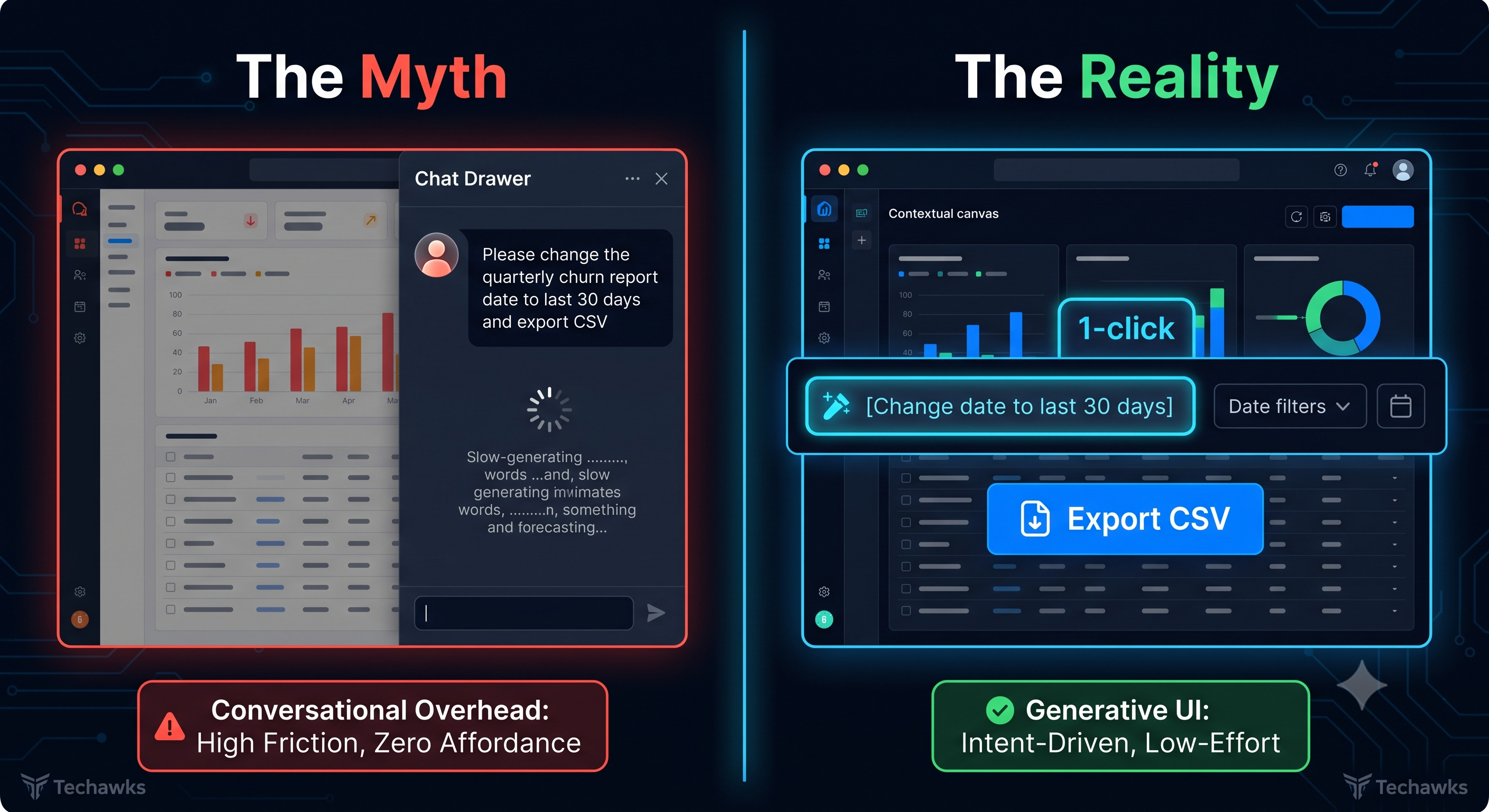 0 Comments 0 Shares 189 Views 0 Reviews
 -
Stop Measuring Feature Velocity: The "Kill-or-Keep" Product Audit
Most product teams fall into the "Feature Factory" trap. Roadmaps are treated like conveyor belts where success is measured by release dates, story points burned, and launch announcements. But every new button, tab, and configuration toggle adds cognitive overhead for your users and maintenance debt for your engineers.
When you default to adding rather than refining or removing, you dilute your core value proposition:
The Sunk Cost Delusion: Teams protect underperforming features simply because they took four sprints to build.
Cognitive Load Creep: What feels like "optional functionality" to an internal team translates to friction and paralysis of choice for a new user.
Ghost Engagement: Users clicking an element repeatedly doesn't automatically mean it's valuable—it often means the design is misleading or navigation is broken.
The 14-Day "Kill-or-Keep" Challenge:
Select one core workflow or major module in your product and run this audit before adding another ticket to your backlog:
Step 1: Map the Tail End. Pull usage analytics for every single interaction element in that workflow over the past 90 days. Identify the bottom 20% of features by recurring, intentional engagement.
Step 2: Run "Friction or Function" Interviews. Talk to 5 active users who ignore those low-usage elements. Verify whether they don't use them because they don't need them, or because the affordance is invisible.
Step 3: Propose One Sunset Candidate. Pick at least one low-utility, high-maintenance feature to deprecate or collapse into a secondary menu. Calculate the saved engineering overhead and the reduction in click steps for the primary path.
Step 4: Shift from Output to Outcome Metrics. Replace "features delivered" on your roadmap status update with "time-to-core-value reduced" or "task completion rate improved."
Key Takeaways
Addition is easy; subtraction is strategy: Great UX is defined by what you leave out, not how many edge cases you cram onto the screen.
Low usage is active technical debt: Neglected features still require QA, documentation, regression testing, and design consistency.
Value over velocity: Shipping faster is pointless if you are delivering functionality users have to navigate around rather than through.
CTA
Ready to move past output-driven backlogs and master outcome-focused design? Join the Product, UX & Design community to collaborate on user research frameworks, interface minimalism, and product strategy.Stop Measuring Feature Velocity: The "Kill-or-Keep" Product Audit Most product teams fall into the "Feature Factory" trap. Roadmaps are treated like conveyor belts where success is measured by release dates, story points burned, and launch announcements. But every new button, tab, and configuration toggle adds cognitive overhead for your users and maintenance debt for your engineers. When you default to adding rather than refining or removing, you dilute your core value proposition: The Sunk Cost Delusion: Teams protect underperforming features simply because they took four sprints to build. Cognitive Load Creep: What feels like "optional functionality" to an internal team translates to friction and paralysis of choice for a new user. Ghost Engagement: Users clicking an element repeatedly doesn't automatically mean it's valuable—it often means the design is misleading or navigation is broken. The 14-Day "Kill-or-Keep" Challenge: Select one core workflow or major module in your product and run this audit before adding another ticket to your backlog: Step 1: Map the Tail End. Pull usage analytics for every single interaction element in that workflow over the past 90 days. Identify the bottom 20% of features by recurring, intentional engagement. Step 2: Run "Friction or Function" Interviews. Talk to 5 active users who ignore those low-usage elements. Verify whether they don't use them because they don't need them, or because the affordance is invisible. Step 3: Propose One Sunset Candidate. Pick at least one low-utility, high-maintenance feature to deprecate or collapse into a secondary menu. Calculate the saved engineering overhead and the reduction in click steps for the primary path. Step 4: Shift from Output to Outcome Metrics. Replace "features delivered" on your roadmap status update with "time-to-core-value reduced" or "task completion rate improved." Key Takeaways Addition is easy; subtraction is strategy: Great UX is defined by what you leave out, not how many edge cases you cram onto the screen. Low usage is active technical debt: Neglected features still require QA, documentation, regression testing, and design consistency. Value over velocity: Shipping faster is pointless if you are delivering functionality users have to navigate around rather than through. CTA Ready to move past output-driven backlogs and master outcome-focused design? Join the Product, UX & Design community to collaborate on user research frameworks, interface minimalism, and product strategy.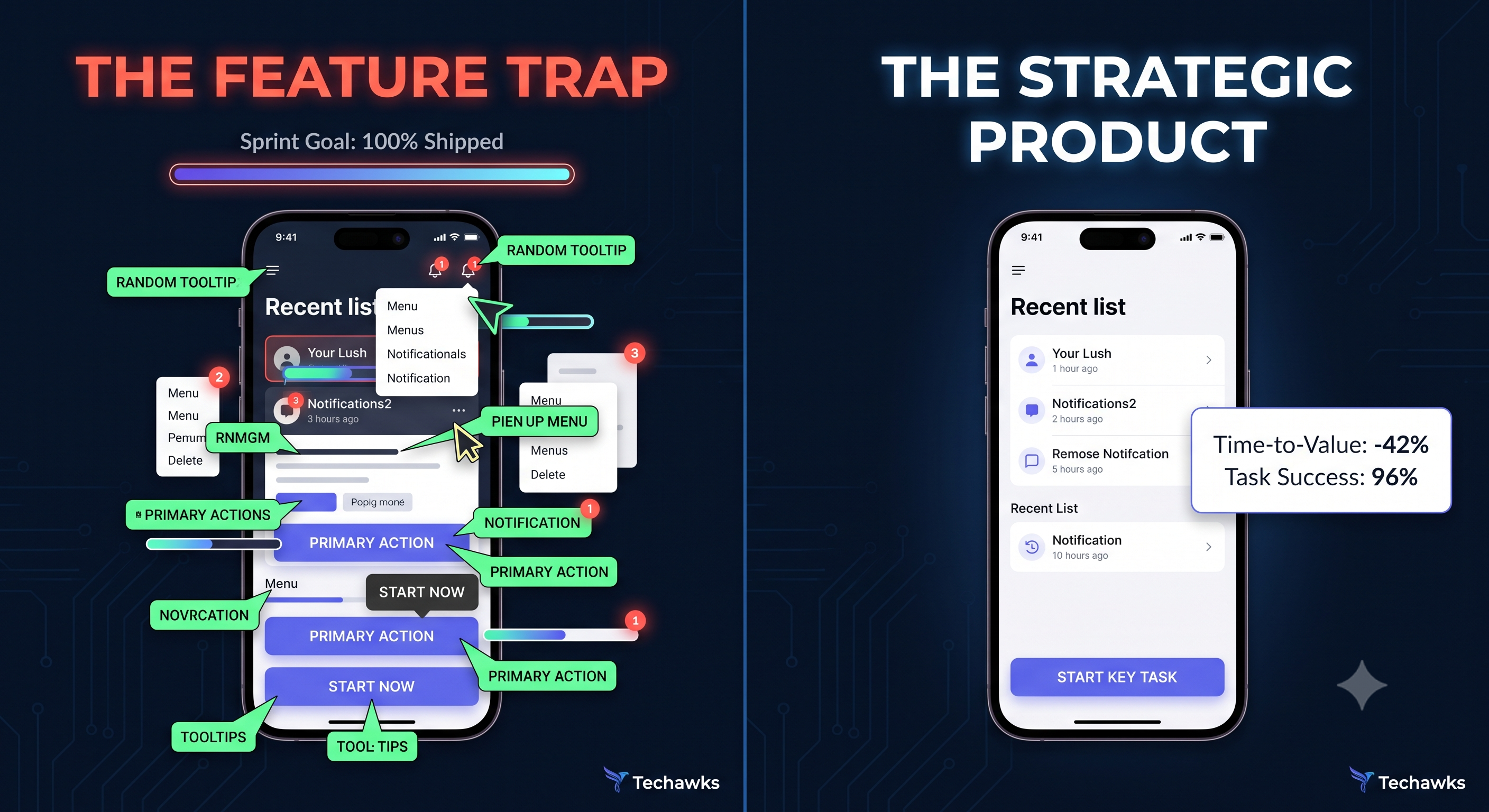 0 Comments 0 Shares 232 Views 0 Reviews
More Stories