


UX Challenge: Spot the 3 Conversion-Killing Design Flaws!
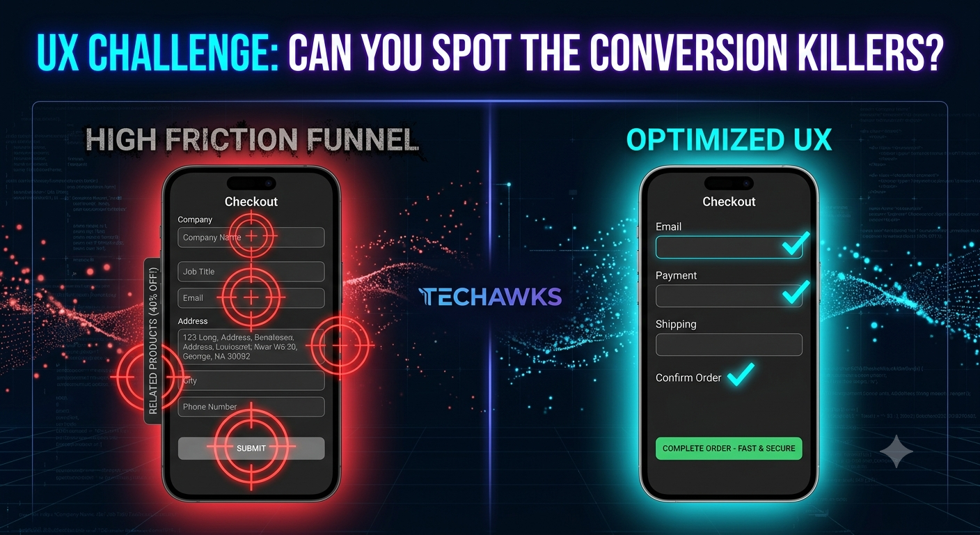
Below is a scenario depicting a standard SaaS checkout page. Review the design choices and count how many friction points you can spot before reading the answers!
📱 The Checkout Scenario
A user clicks "Upgrade to Pro" and is presented with:
A single-page form asking for First Name, Last Name, Email, Phone Number, Billing Address, Company Name, Job Title, and Credit Card Details.
A bright red, full-width button at the bottom labeled "SUBMIT".
A small gray link below the form that reads "Have a coupon code?" which opens a new full-page window when clicked.
🛠️ The Breakdown: What’s Breaking This UX?
🔴 Flaw 1: Excess Form Fields (High Cognitive Load)
The Problem: Asking for non-essential info (Job Title, Phone Number, Company Name) during a simple B2C or self-serve checkout creates unnecessary drop-off.
The Fix: Every additional field reduces conversions. Collect only what is strictly necessary (Email + Payment info) and defer optional profile data to onboarding.
🔴 Flaw 2: Vague Action Hierarchy & Aggressive Microcopy
The Problem: The button text "SUBMIT" is cold, technical, and creates transactional anxiety (what am I submitting? Am I being charged now?).
The Fix: Use outcome-oriented, value-driven microcopy like "Start My 14-Day Free Trial" or "Complete Order ($29/mo)".
🔴 Flaw 3: Flow Interruption (Leaving the Funnel)
The Problem: Opening a new tab/page for a promo code disrupts the checkout mental model and encourages users to leave the page to search Google for coupon codes.
The Fix: Keep discount inputs as inline collapsible text fields directly on the checkout summary panel.
How Did You Score?
3/3 Caught: Senior Product Strategist mindset! 🧠
1-2 Caught: Good instincts—time to refine your microcopy and interaction flows.
0 Caught: Don't worry! Product thinking is a muscle you can train.
Key Takeaways
Minimize Friction: Trim every non-essential input field from primary conversion funnels.
Value-Driven Microcopy: CTA buttons should state clear user benefits, not technical actions like "Submit."
Protect the Funnel: Never give users an excuse or external link to navigate away during payment/signup steps.
CTA
Ready to transform from a feature-builder into a high-impact Product Leader?
Join the Techawks Product, UX & Design Program today to master user research, wireframing, product strategy, and conversion rate optimization! 🚀
Below is a scenario depicting a standard SaaS checkout page. Review the design choices and count how many friction points you can spot before reading the answers!
📱 The Checkout Scenario
A user clicks "Upgrade to Pro" and is presented with:
A single-page form asking for First Name, Last Name, Email, Phone Number, Billing Address, Company Name, Job Title, and Credit Card Details.
A bright red, full-width button at the bottom labeled "SUBMIT".
A small gray link below the form that reads "Have a coupon code?" which opens a new full-page window when clicked.
🛠️ The Breakdown: What’s Breaking This UX?
🔴 Flaw 1: Excess Form Fields (High Cognitive Load)
The Problem: Asking for non-essential info (Job Title, Phone Number, Company Name) during a simple B2C or self-serve checkout creates unnecessary drop-off.
The Fix: Every additional field reduces conversions. Collect only what is strictly necessary (Email + Payment info) and defer optional profile data to onboarding.
🔴 Flaw 2: Vague Action Hierarchy & Aggressive Microcopy
The Problem: The button text "SUBMIT" is cold, technical, and creates transactional anxiety (what am I submitting? Am I being charged now?).
The Fix: Use outcome-oriented, value-driven microcopy like "Start My 14-Day Free Trial" or "Complete Order ($29/mo)".
🔴 Flaw 3: Flow Interruption (Leaving the Funnel)
The Problem: Opening a new tab/page for a promo code disrupts the checkout mental model and encourages users to leave the page to search Google for coupon codes.
The Fix: Keep discount inputs as inline collapsible text fields directly on the checkout summary panel.
How Did You Score?
3/3 Caught: Senior Product Strategist mindset! 🧠
1-2 Caught: Good instincts—time to refine your microcopy and interaction flows.
0 Caught: Don't worry! Product thinking is a muscle you can train.
Key Takeaways
Minimize Friction: Trim every non-essential input field from primary conversion funnels.
Value-Driven Microcopy: CTA buttons should state clear user benefits, not technical actions like "Submit."
Protect the Funnel: Never give users an excuse or external link to navigate away during payment/signup steps.
CTA
Ready to transform from a feature-builder into a high-impact Product Leader?
Join the Techawks Product, UX & Design Program today to master user research, wireframing, product strategy, and conversion rate optimization! 🚀
UX Challenge: Spot the 3 Conversion-Killing Design Flaws!
Below is a scenario depicting a standard SaaS checkout page. Review the design choices and count how many friction points you can spot before reading the answers!
📱 The Checkout Scenario
A user clicks "Upgrade to Pro" and is presented with:
A single-page form asking for First Name, Last Name, Email, Phone Number, Billing Address, Company Name, Job Title, and Credit Card Details.
A bright red, full-width button at the bottom labeled "SUBMIT".
A small gray link below the form that reads "Have a coupon code?" which opens a new full-page window when clicked.
🛠️ The Breakdown: What’s Breaking This UX?
🔴 Flaw 1: Excess Form Fields (High Cognitive Load)
The Problem: Asking for non-essential info (Job Title, Phone Number, Company Name) during a simple B2C or self-serve checkout creates unnecessary drop-off.
The Fix: Every additional field reduces conversions. Collect only what is strictly necessary (Email + Payment info) and defer optional profile data to onboarding.
🔴 Flaw 2: Vague Action Hierarchy & Aggressive Microcopy
The Problem: The button text "SUBMIT" is cold, technical, and creates transactional anxiety (what am I submitting? Am I being charged now?).
The Fix: Use outcome-oriented, value-driven microcopy like "Start My 14-Day Free Trial" or "Complete Order ($29/mo)".
🔴 Flaw 3: Flow Interruption (Leaving the Funnel)
The Problem: Opening a new tab/page for a promo code disrupts the checkout mental model and encourages users to leave the page to search Google for coupon codes.
The Fix: Keep discount inputs as inline collapsible text fields directly on the checkout summary panel.
How Did You Score?
3/3 Caught: Senior Product Strategist mindset! 🧠
1-2 Caught: Good instincts—time to refine your microcopy and interaction flows.
0 Caught: Don't worry! Product thinking is a muscle you can train.
Key Takeaways
Minimize Friction: Trim every non-essential input field from primary conversion funnels.
Value-Driven Microcopy: CTA buttons should state clear user benefits, not technical actions like "Submit."
Protect the Funnel: Never give users an excuse or external link to navigate away during payment/signup steps.
CTA
Ready to transform from a feature-builder into a high-impact Product Leader?
Join the Techawks Product, UX & Design Program today to master user research, wireframing, product strategy, and conversion rate optimization! 🚀

 English
 Arabic
 Spanish
 Portuguese
 Deutsch
 Turkish
 Dutch
Dutch
 Italiano
 Russian
 Romaian
 Portuguese (Brazil)
 Greek
Greek