


The UX Audit Playbook: 5 Heuristics Every Product Team Should Master
A UX audit evaluates an existing digital product against established usability principles to identify pain points, bottlenecks, and cognitive overload.
Whether you are launching a new feature or optimizing an existing flow, run your screens through these five essential design heuristics:
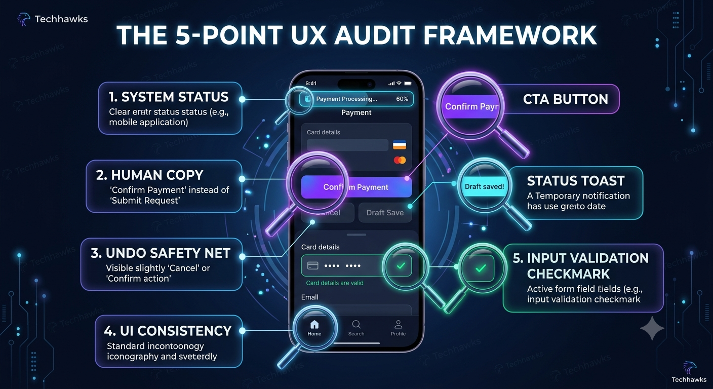
1. Visibility of System Status
Users should always know what the app is doing and where they are in a process.
The Check: Are loading states, progress bars, and success messages clear?
Action: Never leave a user staring at a blank screen after clicking a primary action. Provide instant visual feedback (spinners, skeletons, or toast notifications).
2. Match Between System and the Real World
Speak the user’s language, not your database schema’s internal terms.
The Check: Is your UI copy full of technical jargon or ambiguous internal naming?
Action: Replace terms like Error 504: Transaction Exception with clear, human-centered language like "We couldn't process your payment. Please try again in a moment."
3. User Control & Freedom (The "Undo" Safety Net)
Users often perform actions by mistake and need a clearly marked "emergency exit."
The Check: Can users easily cancel an action, go back a step, or undo a critical change?
Action: Implement explicit Cancel, Undo, or Draft Save options, especially during multi-step modal or form flows.
4. Consistency and Standards
Users spend most of their time on other apps. They expect your interface to follow established conventions.
The Check: Are buttons, icons, and navigation elements performing predictable functions?
Action: Stick to standard UI patterns (e.g., shopping cart top right, primary CTA button bottom right on desktop) so users don't have to re-learn basic interactions.
5. Error Prevention Over Error Messages
Great UX minimizes errors before they can happen rather than just providing good error messages afterward.
The Check: Does the form let users type invalid inputs before hitting submit?
Action: Use smart defaults, inline field validation, and disable primary submission buttons until all required fields are valid.
Key Takeaways
Feedback is Mandatory: Every user interaction requires immediate, clear visual feedback.
Reduce Cognitive Load: Standard UI patterns beat "clever" unconventional navigation every time.
Prevent > Correct: Eliminate error-prone conditions upfront with inline validation and smart input constraints.
CTA (Join Product, UX & Design)
Want to level up your product sense, participate in design teardowns, and master user-centric product strategy alongside experienced PMs and designers?
🎨 Join the Product, UX & Design community today to get design reviews, framework templates, and real-world case studies!
A UX audit evaluates an existing digital product against established usability principles to identify pain points, bottlenecks, and cognitive overload.
Whether you are launching a new feature or optimizing an existing flow, run your screens through these five essential design heuristics:
1. Visibility of System Status
Users should always know what the app is doing and where they are in a process.
The Check: Are loading states, progress bars, and success messages clear?
Action: Never leave a user staring at a blank screen after clicking a primary action. Provide instant visual feedback (spinners, skeletons, or toast notifications).
2. Match Between System and the Real World
Speak the user’s language, not your database schema’s internal terms.
The Check: Is your UI copy full of technical jargon or ambiguous internal naming?
Action: Replace terms like Error 504: Transaction Exception with clear, human-centered language like "We couldn't process your payment. Please try again in a moment."
3. User Control & Freedom (The "Undo" Safety Net)
Users often perform actions by mistake and need a clearly marked "emergency exit."
The Check: Can users easily cancel an action, go back a step, or undo a critical change?
Action: Implement explicit Cancel, Undo, or Draft Save options, especially during multi-step modal or form flows.
4. Consistency and Standards
Users spend most of their time on other apps. They expect your interface to follow established conventions.
The Check: Are buttons, icons, and navigation elements performing predictable functions?
Action: Stick to standard UI patterns (e.g., shopping cart top right, primary CTA button bottom right on desktop) so users don't have to re-learn basic interactions.
5. Error Prevention Over Error Messages
Great UX minimizes errors before they can happen rather than just providing good error messages afterward.
The Check: Does the form let users type invalid inputs before hitting submit?
Action: Use smart defaults, inline field validation, and disable primary submission buttons until all required fields are valid.
Key Takeaways
Feedback is Mandatory: Every user interaction requires immediate, clear visual feedback.
Reduce Cognitive Load: Standard UI patterns beat "clever" unconventional navigation every time.
Prevent > Correct: Eliminate error-prone conditions upfront with inline validation and smart input constraints.
CTA (Join Product, UX & Design)
Want to level up your product sense, participate in design teardowns, and master user-centric product strategy alongside experienced PMs and designers?
🎨 Join the Product, UX & Design community today to get design reviews, framework templates, and real-world case studies!
The UX Audit Playbook: 5 Heuristics Every Product Team Should Master
A UX audit evaluates an existing digital product against established usability principles to identify pain points, bottlenecks, and cognitive overload.
Whether you are launching a new feature or optimizing an existing flow, run your screens through these five essential design heuristics:
1. Visibility of System Status
Users should always know what the app is doing and where they are in a process.
The Check: Are loading states, progress bars, and success messages clear?
Action: Never leave a user staring at a blank screen after clicking a primary action. Provide instant visual feedback (spinners, skeletons, or toast notifications).
2. Match Between System and the Real World
Speak the user’s language, not your database schema’s internal terms.
The Check: Is your UI copy full of technical jargon or ambiguous internal naming?
Action: Replace terms like Error 504: Transaction Exception with clear, human-centered language like "We couldn't process your payment. Please try again in a moment."
3. User Control & Freedom (The "Undo" Safety Net)
Users often perform actions by mistake and need a clearly marked "emergency exit."
The Check: Can users easily cancel an action, go back a step, or undo a critical change?
Action: Implement explicit Cancel, Undo, or Draft Save options, especially during multi-step modal or form flows.
4. Consistency and Standards
Users spend most of their time on other apps. They expect your interface to follow established conventions.
The Check: Are buttons, icons, and navigation elements performing predictable functions?
Action: Stick to standard UI patterns (e.g., shopping cart top right, primary CTA button bottom right on desktop) so users don't have to re-learn basic interactions.
5. Error Prevention Over Error Messages
Great UX minimizes errors before they can happen rather than just providing good error messages afterward.
The Check: Does the form let users type invalid inputs before hitting submit?
Action: Use smart defaults, inline field validation, and disable primary submission buttons until all required fields are valid.
Key Takeaways
Feedback is Mandatory: Every user interaction requires immediate, clear visual feedback.
Reduce Cognitive Load: Standard UI patterns beat "clever" unconventional navigation every time.
Prevent > Correct: Eliminate error-prone conditions upfront with inline validation and smart input constraints.
CTA (Join Product, UX & Design)
Want to level up your product sense, participate in design teardowns, and master user-centric product strategy alongside experienced PMs and designers?
🎨 Join the Product, UX & Design community today to get design reviews, framework templates, and real-world case studies!

 English
 French
 Spanish
 Portuguese
 Deutsch
 Turkish
 Dutch
Dutch
 Italiano
 Russian
 Romaian
 Portuguese (Brazil)
 Greek
Greek