


The Ultimate Indian Developer’s Guide to Building Low-Data, High-Performance Web Apps
Building applications tailored for the Indian market requires a mindset shift: Performance isn't a feature; it's accessibility. Here are four practical, battle-tested techniques to optimize your web apps for patchy networks and varying data plans.
1. Implement Aggressive Image Optimization
Images account for over 60% of average page weight.
Adopt Next-Gen Formats: Convert standard JPEGs and PNGs to AVIF or WebP. This simple step reduces file sizes by up to 30–50% without visible quality loss.
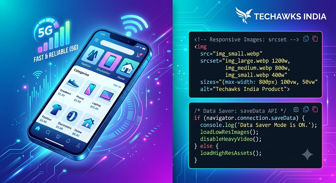
Use Native Responsive Images: Implement the standard HTML <picture> tag or srcset attribute to serve scaled-down image sizes to mobile screens instead of forcing high-resolution desktop assets onto low-end smartphones.
2. Cache Assets Client-Side with Service Workers
Network requests fail when connections drop. A lightweight Service Worker turns network instability into a non-issue by serving assets locally.
Cache First Strategy: Store static assets like UI icons, fonts, and core stylesheets during the initial load.
Stale-While-Revalidate: Instantly render cached content to the user while silently fetching updated data in the background when a network connection becomes available.
3. Tree-Shake & Code-Split JavaScript Bundles
Large JavaScript bundles block rendering, especially on budget processors common in entry-level mobile devices.
Route-Based Splitting: Load only the JavaScript needed for the current screen using dynamic imports (import()).
Audit Heavy Libraries: Replace massive dependencies (e.g., Moment.js) with modular alternatives (e.g., date-fns or native JavaScript Intl APIs).
4. Enable Data-Saver Mode Detection
Modern web browsers allow you to detect when a user explicitly turns on "Data Saver" mode using the navigator.connection.saveData API.
Dynamic Content Loading: If saveData is true, automatically disable auto-playing videos, replace high-res background banners with solid colors, and defer non-essential API fetches.
Key Takeaways
Format matters: Shift to WebP/AVIF and serve responsive image sizes.
Offline resilience: Use Service Workers to cache vital assets and shield users from intermittent connectivity.
Lean bundles: Load code dynamically on demand instead of shipping monolithic JS bundles.
Respect user preferences: Detect saveData flags to serve lightweight experiences automatically.
CTA (Join Techawks India)
🚀 Want to build tech that impacts millions across India?
Join the Techawks India community to connect with developer peers, share architectural blueprints, and stay ahead in the Indian tech ecosystem.
👉 [Join Techawks India Today]
Building applications tailored for the Indian market requires a mindset shift: Performance isn't a feature; it's accessibility. Here are four practical, battle-tested techniques to optimize your web apps for patchy networks and varying data plans.
1. Implement Aggressive Image Optimization
Images account for over 60% of average page weight.
Adopt Next-Gen Formats: Convert standard JPEGs and PNGs to AVIF or WebP. This simple step reduces file sizes by up to 30–50% without visible quality loss.
Use Native Responsive Images: Implement the standard HTML <picture> tag or srcset attribute to serve scaled-down image sizes to mobile screens instead of forcing high-resolution desktop assets onto low-end smartphones.
2. Cache Assets Client-Side with Service Workers
Network requests fail when connections drop. A lightweight Service Worker turns network instability into a non-issue by serving assets locally.
Cache First Strategy: Store static assets like UI icons, fonts, and core stylesheets during the initial load.
Stale-While-Revalidate: Instantly render cached content to the user while silently fetching updated data in the background when a network connection becomes available.
3. Tree-Shake & Code-Split JavaScript Bundles
Large JavaScript bundles block rendering, especially on budget processors common in entry-level mobile devices.
Route-Based Splitting: Load only the JavaScript needed for the current screen using dynamic imports (import()).
Audit Heavy Libraries: Replace massive dependencies (e.g., Moment.js) with modular alternatives (e.g., date-fns or native JavaScript Intl APIs).
4. Enable Data-Saver Mode Detection
Modern web browsers allow you to detect when a user explicitly turns on "Data Saver" mode using the navigator.connection.saveData API.
Dynamic Content Loading: If saveData is true, automatically disable auto-playing videos, replace high-res background banners with solid colors, and defer non-essential API fetches.
Key Takeaways
Format matters: Shift to WebP/AVIF and serve responsive image sizes.
Offline resilience: Use Service Workers to cache vital assets and shield users from intermittent connectivity.
Lean bundles: Load code dynamically on demand instead of shipping monolithic JS bundles.
Respect user preferences: Detect saveData flags to serve lightweight experiences automatically.
CTA (Join Techawks India)
🚀 Want to build tech that impacts millions across India?
Join the Techawks India community to connect with developer peers, share architectural blueprints, and stay ahead in the Indian tech ecosystem.
👉 [Join Techawks India Today]
The Ultimate Indian Developer’s Guide to Building Low-Data, High-Performance Web Apps
Building applications tailored for the Indian market requires a mindset shift: Performance isn't a feature; it's accessibility. Here are four practical, battle-tested techniques to optimize your web apps for patchy networks and varying data plans.
1. Implement Aggressive Image Optimization
Images account for over 60% of average page weight.
Adopt Next-Gen Formats: Convert standard JPEGs and PNGs to AVIF or WebP. This simple step reduces file sizes by up to 30–50% without visible quality loss.
Use Native Responsive Images: Implement the standard HTML <picture> tag or srcset attribute to serve scaled-down image sizes to mobile screens instead of forcing high-resolution desktop assets onto low-end smartphones.
2. Cache Assets Client-Side with Service Workers
Network requests fail when connections drop. A lightweight Service Worker turns network instability into a non-issue by serving assets locally.
Cache First Strategy: Store static assets like UI icons, fonts, and core stylesheets during the initial load.
Stale-While-Revalidate: Instantly render cached content to the user while silently fetching updated data in the background when a network connection becomes available.
3. Tree-Shake & Code-Split JavaScript Bundles
Large JavaScript bundles block rendering, especially on budget processors common in entry-level mobile devices.
Route-Based Splitting: Load only the JavaScript needed for the current screen using dynamic imports (import()).
Audit Heavy Libraries: Replace massive dependencies (e.g., Moment.js) with modular alternatives (e.g., date-fns or native JavaScript Intl APIs).
4. Enable Data-Saver Mode Detection
Modern web browsers allow you to detect when a user explicitly turns on "Data Saver" mode using the navigator.connection.saveData API.
Dynamic Content Loading: If saveData is true, automatically disable auto-playing videos, replace high-res background banners with solid colors, and defer non-essential API fetches.
Key Takeaways
Format matters: Shift to WebP/AVIF and serve responsive image sizes.
Offline resilience: Use Service Workers to cache vital assets and shield users from intermittent connectivity.
Lean bundles: Load code dynamically on demand instead of shipping monolithic JS bundles.
Respect user preferences: Detect saveData flags to serve lightweight experiences automatically.
CTA (Join Techawks India)
🚀 Want to build tech that impacts millions across India?
Join the Techawks India community to connect with developer peers, share architectural blueprints, and stay ahead in the Indian tech ecosystem.
👉 [Join Techawks India Today]

 English
 French
 Spanish
 Portuguese
 Deutsch
 Turkish
 Dutch
Dutch
 Italiano
 Russian
 Romaian
 Portuguese (Brazil)
 Greek
Greek