


Tool Breakdown: Figma vs. Storybook—Where Does UX End and Product Engineering Begin?
Every modern product team relies on visual design tools and component libraries. But confusing a design file with a production asset is what causes inconsistent UI, double work, and endless Slack debates between design and engineering.
Here is an objective, practical review of Figma vs. Storybook in product workflows—and how to bridge the gap between them.
1. Vector Wireframing & Design Systems (Figma)
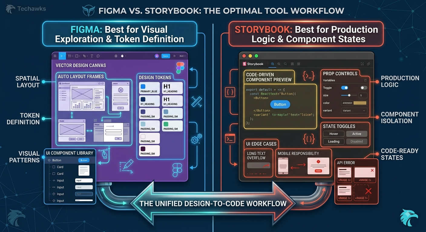
Figma: Winner. Unmatched for rapid visual exploration, vector manipulation, and interactive prototyping. Features like Auto Layout and Variables mirror code concepts, allowing designers to structure design tokens (colors, spacing, typography) visually.
Storybook: Poor choice for early design exploration. Building or tweaking raw UI components straight in code before visual direction is locked wastes valuable engineering time.
Rule of Thumb: Use Figma for ideation, spatial layout testing, micro-animations, and establishing high-level visual design patterns.
2. State Management & True Interactive Logic (Storybook)
Figma: Limited to vector states and linked frame interactions. Simulating real app behavior—like edge cases, long text overflow, responsive breakpoints across device widths, or API error states—requires creating dozens of cluttered, unmaintainable duplicate frames.
Storybook: Winner. Storybook acts as an isolated workshop for UI components built in actual production code (React, Vue, Web Components). It allows engineers and product managers to test every real-world state (loading, disabled, hover, error, dynamic data) without spinning up the backend app.
Rule of Thumb: Use Storybook as the single source of truth for component logic, edge cases, responsiveness, and code documentation.
The Strategy: The Unified Handoff Stack
To eliminate design-to-code drift and ship features faster, align your workflow across both tools:
Token Synchronization: Export design tokens (colors, typography scales, padding rules) directly from Figma into CSS variables/JSON tokens that power Storybook components.
Component Mapping: Ensure Figma component variant names mirror the exact prop names used in Storybook.
The Handoff Bridge: Embed Storybook previews directly inside Figma frames using plugins (or link Figma files directly in Storybook stories).
Key Takeaways
Figma is for Layout & Exploration: Keep your design canvas clean by focusing on visual hierarchy, tokens, and flow prototypes.
Storybook is for Component Reality: Validate real code states, responsive behavior, and accessibility inside Storybook before merging to production.
Sync Tokens, Not Static Assets: Connect both tools using shared token structures to keep design and code in perpetual sync.
CTA
Want to master seamless design-to-code workflows, modern design systems, and practical UX strategy? Join Product, UX & Design at Techawks today to level up your technical design skills.
Every modern product team relies on visual design tools and component libraries. But confusing a design file with a production asset is what causes inconsistent UI, double work, and endless Slack debates between design and engineering.
Here is an objective, practical review of Figma vs. Storybook in product workflows—and how to bridge the gap between them.
1. Vector Wireframing & Design Systems (Figma)
Figma: Winner. Unmatched for rapid visual exploration, vector manipulation, and interactive prototyping. Features like Auto Layout and Variables mirror code concepts, allowing designers to structure design tokens (colors, spacing, typography) visually.
Storybook: Poor choice for early design exploration. Building or tweaking raw UI components straight in code before visual direction is locked wastes valuable engineering time.
Rule of Thumb: Use Figma for ideation, spatial layout testing, micro-animations, and establishing high-level visual design patterns.
2. State Management & True Interactive Logic (Storybook)
Figma: Limited to vector states and linked frame interactions. Simulating real app behavior—like edge cases, long text overflow, responsive breakpoints across device widths, or API error states—requires creating dozens of cluttered, unmaintainable duplicate frames.
Storybook: Winner. Storybook acts as an isolated workshop for UI components built in actual production code (React, Vue, Web Components). It allows engineers and product managers to test every real-world state (loading, disabled, hover, error, dynamic data) without spinning up the backend app.
Rule of Thumb: Use Storybook as the single source of truth for component logic, edge cases, responsiveness, and code documentation.
The Strategy: The Unified Handoff Stack
To eliminate design-to-code drift and ship features faster, align your workflow across both tools:
Token Synchronization: Export design tokens (colors, typography scales, padding rules) directly from Figma into CSS variables/JSON tokens that power Storybook components.
Component Mapping: Ensure Figma component variant names mirror the exact prop names used in Storybook.
The Handoff Bridge: Embed Storybook previews directly inside Figma frames using plugins (or link Figma files directly in Storybook stories).
Key Takeaways
Figma is for Layout & Exploration: Keep your design canvas clean by focusing on visual hierarchy, tokens, and flow prototypes.
Storybook is for Component Reality: Validate real code states, responsive behavior, and accessibility inside Storybook before merging to production.
Sync Tokens, Not Static Assets: Connect both tools using shared token structures to keep design and code in perpetual sync.
CTA
Want to master seamless design-to-code workflows, modern design systems, and practical UX strategy? Join Product, UX & Design at Techawks today to level up your technical design skills.
Tool Breakdown: Figma vs. Storybook—Where Does UX End and Product Engineering Begin?
Every modern product team relies on visual design tools and component libraries. But confusing a design file with a production asset is what causes inconsistent UI, double work, and endless Slack debates between design and engineering.
Here is an objective, practical review of Figma vs. Storybook in product workflows—and how to bridge the gap between them.
1. Vector Wireframing & Design Systems (Figma)
Figma: Winner. Unmatched for rapid visual exploration, vector manipulation, and interactive prototyping. Features like Auto Layout and Variables mirror code concepts, allowing designers to structure design tokens (colors, spacing, typography) visually.
Storybook: Poor choice for early design exploration. Building or tweaking raw UI components straight in code before visual direction is locked wastes valuable engineering time.
Rule of Thumb: Use Figma for ideation, spatial layout testing, micro-animations, and establishing high-level visual design patterns.
2. State Management & True Interactive Logic (Storybook)
Figma: Limited to vector states and linked frame interactions. Simulating real app behavior—like edge cases, long text overflow, responsive breakpoints across device widths, or API error states—requires creating dozens of cluttered, unmaintainable duplicate frames.
Storybook: Winner. Storybook acts as an isolated workshop for UI components built in actual production code (React, Vue, Web Components). It allows engineers and product managers to test every real-world state (loading, disabled, hover, error, dynamic data) without spinning up the backend app.
Rule of Thumb: Use Storybook as the single source of truth for component logic, edge cases, responsiveness, and code documentation.
The Strategy: The Unified Handoff Stack
To eliminate design-to-code drift and ship features faster, align your workflow across both tools:
Token Synchronization: Export design tokens (colors, typography scales, padding rules) directly from Figma into CSS variables/JSON tokens that power Storybook components.
Component Mapping: Ensure Figma component variant names mirror the exact prop names used in Storybook.
The Handoff Bridge: Embed Storybook previews directly inside Figma frames using plugins (or link Figma files directly in Storybook stories).
Key Takeaways
Figma is for Layout & Exploration: Keep your design canvas clean by focusing on visual hierarchy, tokens, and flow prototypes.
Storybook is for Component Reality: Validate real code states, responsive behavior, and accessibility inside Storybook before merging to production.
Sync Tokens, Not Static Assets: Connect both tools using shared token structures to keep design and code in perpetual sync.
CTA
Want to master seamless design-to-code workflows, modern design systems, and practical UX strategy? Join Product, UX & Design at Techawks today to level up your technical design skills.

 English
 Arabic
 French
 Spanish
 Portuguese
 Deutsch
 Turkish
 Dutch
Dutch
 Italiano
 Russian
 Romaian
 Portuguese (Brazil)